Once all the titling was complete and I had the sign off on all the footage/sound the film was ready. I was really happy with the final product although of course a few things could have been done differently it turned out great and I had a very good team. Communication throughout the project was very good which I think helped the success of the us as a group and the project as well.
Saturday, 7 May 2016
Titling and idents
It's important for the professional look of the film to have good titles and idents. For the titles I used a nice "hand drawn" type and then to give it a bit more life I gave it a little wiggle in after effects. I used a displacement map on the text hooked up to a fractal noise layer to make the text move slightly. This made sure the text fit in with the rest of the hand drawn aesthetic of the animation. I did idiotically spell Lauren's name wrong but fortunately since I kept sending the work back and forth it was quickly corrected.
For the college logo I thought it was a bit plain to just have the black and white logo in the animation. I downloaded a copy which had a transparency layer which was very useful as it meant I could use a trk mt with it. I composited one of the water colour backgrounds in with it to make it fit more with the overall composition. For the opening logo I wanted it to be a little more animated so I took a series of water colour splatter brushes in photoshop and layered them up with a track mat to have a similar effect. It gave a nice playful look to the whole thing and felt it made the piece look more professional.
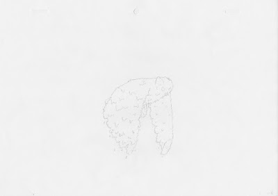
As a group collective we needed to represent our selves at the start of the animation like most production companies do. We had labeled ourselves team OWL so we went with that. I had an idea that we could produce an ident were we all pitch into the animation and create something like this: but using an owl flying sequence instead. Wing created the outline frames for the owl flying then we each did three frames in the cycle which was then put together with some hand drawn type. Here are my 3 drawings for it:


For the college logo I thought it was a bit plain to just have the black and white logo in the animation. I downloaded a copy which had a transparency layer which was very useful as it meant I could use a trk mt with it. I composited one of the water colour backgrounds in with it to make it fit more with the overall composition. For the opening logo I wanted it to be a little more animated so I took a series of water colour splatter brushes in photoshop and layered them up with a track mat to have a similar effect. It gave a nice playful look to the whole thing and felt it made the piece look more professional.
As a group collective we needed to represent our selves at the start of the animation like most production companies do. We had labeled ourselves team OWL so we went with that. I had an idea that we could produce an ident were we all pitch into the animation and create something like this:
 but using an owl flying sequence instead. Wing created the outline frames for the owl flying then we each did three frames in the cycle which was then put together with some hand drawn type. Here are my 3 drawings for it:
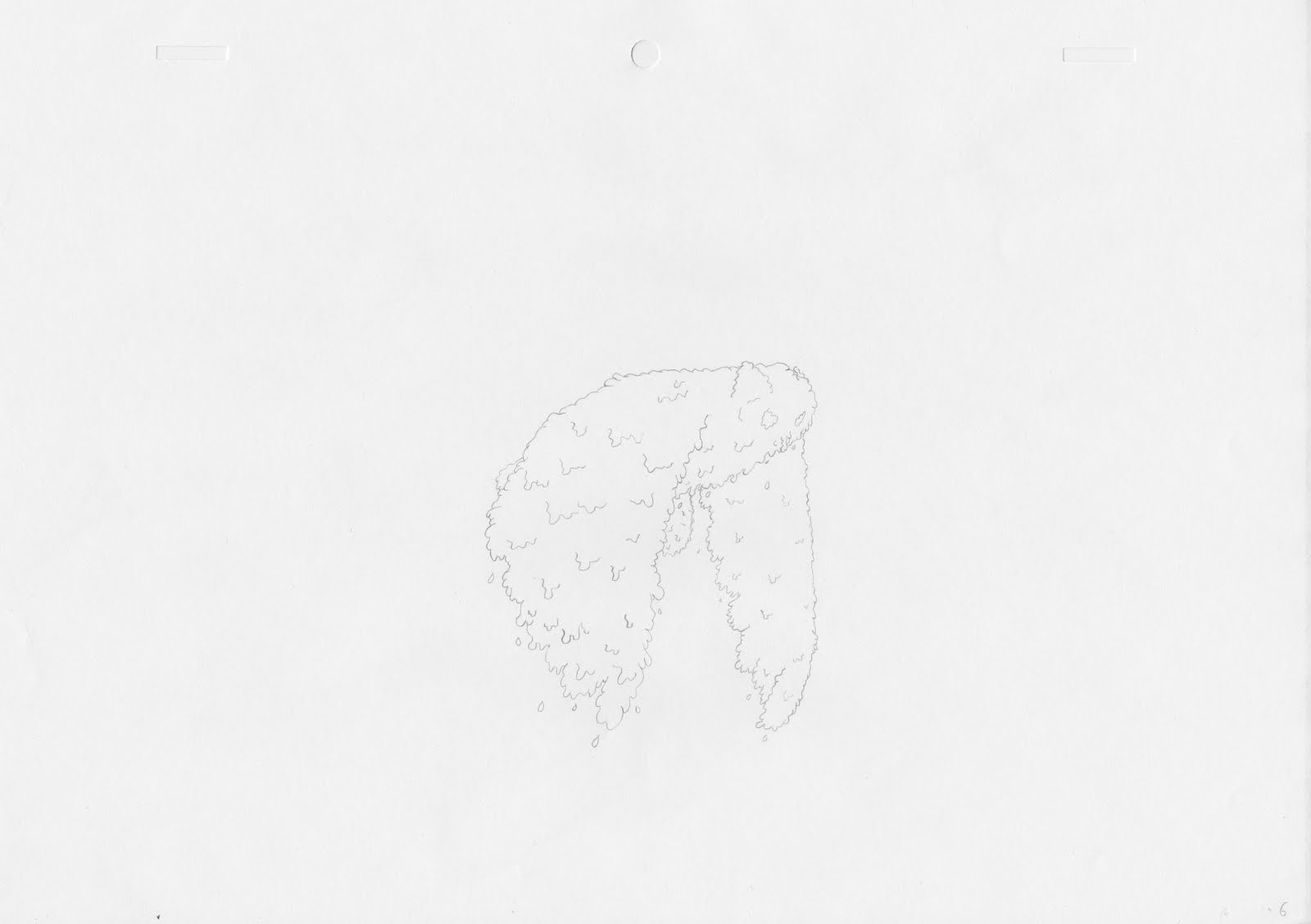


Getting sign offs
Once I'd done the "final" edits I kept sending the changes through to the group asking for feedback n it. Any changes to sound and the video were open so I could fix any problems I missed. I wanted the animation to be nicely polished and am aware that I could easily miss things or think some sounds may work better than they actually do.
This proved really effective especially when I stressed that I wanted criticism on it I got good feedback to help me improve the edit further. This is definitely something that should be done with all group work.
This proved really effective especially when I stressed that I wanted criticism on it I got good feedback to help me improve the edit further. This is definitely something that should be done with all group work.
The premiere edit (sound)
Once all the sound a compositing was completed I could move on to the final edit. I was unsure how many sound effects were needed but I didn't think it would be many. The first edit was just with the narration and the animation seemed to lack a lot of impact, it was definitely missing something. I added a series of sound effects for things that were going on in the animation but the sound still seemed vary sparse and there were quite a few silent sections that were very jarring. I thought it would be a good idea to put sound to the animated pencil lines and colouring as this made up a lot of the quite sections in the animations. I couldn't ind any goo pencil sounds online so I recorded a range of pencil sound fx myself. This worked out really well and I think it definitely gave the piece what it was missing.
Voice recording MK2
We had a set of voice recording from our group made so we could establish the animatic timings but they were not as good as they could be and the narration was an integral part of our animation. We should have done this before we started production but we didn't manage to before easter by which time we had to start production as it was three valuable working weeks. For future project I will make sure final voice recordings are a number one priority.
We got a variety of people to voice act for us and got them to do multiple scenes from our animation we tried to get as many as possible to do it so we had a good range to choose from. We showed them the animatic before hand with the original recordings to try and replicate similar timings. I was happy with the results we got from the session and they were much better than the ones used in the animatic.
We got a variety of people to voice act for us and got them to do multiple scenes from our animation we tried to get as many as possible to do it so we had a good range to choose from. We showed them the animatic before hand with the original recordings to try and replicate similar timings. I was happy with the results we got from the session and they were much better than the ones used in the animatic.
Putting all the edited footage together
I wanted to export each story separately from after effects but in no smaller pieces as I felt it would cause problems in premiere. I was also rendering the videos out as lossless files so I didn't want lots of massive clips. To make sure everything was edited correctly I put the animatic into the final comps of the 3 stories to make sure the timings were the same. In some places I increased lengths of video when I felt it was needed. A lot of the clips required holds to make sure they were the correct lengths so I just grabbed the final frames and put them at the end on the image sequences. This was a lengthy process because I had to go through many pre compositions but the flow chart in AE really helped. This method was nice an easy when it came to editing because there were only 3 videos I needed to re-render if changes where made so there was little room for confusion.
Colouring the animation
Colouring the animation was a fairly straight forward task since the technique was already established in the pre production phase. Each scene with colour needed to be filled in frame by frame to then be composited in after effects using track mats. This was fairly easy to do just a little time consuming.
A problem I noticed when I composited the first colour was that I hadn't used proper water colour paper. The texture of the colouring and paper was not very nice and stuck out from the main background. I went a brought some actual nice water colour paper and the results were much better.
Another problem I encountered was having two separate colours with this technique. I was unsure how this would work as I couldn't try to have two colours in the track mat background as the animation moves over the still. I figured out I would have to colour the separate parts of the animation twice if I wanted two colours. This would allow me to set up two separate tracks mats afterwards.
We wanted the colour to feel realistic (like it was actual water colour) so I used the custom brush I developed previously during the experimenting phase of the project. I used this when the colour was brought into a scene to make it seem more natural. Using the angle jitter settings I made sure each brush stroke looked different. To keep the colour in the lines I tested between just rubbing out overlap and trying to colour using the selection tool. The problem with the selection tool is it often left very hard edges which looked very out of place.
File organisation
Although this seems like a boring and straight forward task when doing post production on a project like this its vital that files are organised properly especially in the after effects project file.
Since I ended up having over 300 differently files including frames and colouring to work from it was really important I knew where everything was. I used lots of folders in the project panel to organise everything and also made sure all folders things were rendered too were labeled.
 A really useful tool I like to use a lot to make sure everything was in the correct place is the after effect flow chart. This function allows to see which compositions are in which and what things precompose into.
Since I ended up having over 300 differently files including frames and colouring to work from it was really important I knew where everything was. I used lots of folders in the project panel to organise everything and also made sure all folders things were rendered too were labeled.

Masking problems
Masking is an important part of the post production it allows backgrounds and overlapping animation to blocked out, they generally make the animation look more polished overall. The problem with the channel effects is they prohibit masking as they are already turning things to transparency. To get round this I needed to precomp all layers that required masking and make sure the effects where inside the precomp so they don't effect the mask. I'm glad this was a relatively quick fix.
animating in post
Some scenes seemed like they would be a waste of time to animate on paper as it wouldn't look any better. I laid out all the possible things that I could animate in after effects rather than on paper and then Lauren and Wing could decide which scene where not worth doing by hand. Scene like the cracking scene:
where animated using the stroke effect, its fairly simple to use just requires some attention from the pen tool to create a lot of masks. Wing draw the original cracks a few times so it looked more like it had been all animated by hand. I think the effect worked really well and definitely saved some valuable production time.
The stroke effect was also use to transition some backgrounds, as sometimes it was a little jarring when the scenes just completely changed to a solid background I use stroke to help them transition in.
Another section that was done in after effects was the bus driving away, it would be an overly lengthy way to do it by hand so I was just able to control its position and scale in AE.
Starting production
Wing and Lauren took the bulk of the production as they were more confident with traditional animation and I was going to do all the post production. I did however want to do some production as I wanted to practice my animation skills.
I animated 3 storyboard panels from scratch on paper. I found some of it to be quite challenging I had not done any paper animating in a long time and struggled with out being able to preview my work like you can digitally animating. Although I realised paper animation was not for me I felt like its a good challenge as an animator and I should try more in future as it really improves both drawing and animation skills.
I found staying on model quite difficult. I realised however that keeping the original designs in front of me helped a lot so little details wouldn't go missing.
It was nice working on a project like this as there are often things I would normally try and avoid as an animator but this pushed me out of my comfort zone especially the scene where the bear climbs over the fence as the angle on the bear keeps changing although it could have been better I'm happy with my efforts and felt I improved along the way.
Starting post production
Starting post production needed to happen as soon as possible as I knew I had a lot to do and normally not much time is allocated to the job. I asked that all frames were scanned and uploaded to the drive when they were completed which meant I could start working on them right away. All the footage given needed to be edited so they would work with the same background texture and colouring. I used the same tested technique as before using a combination of 4 channel effects I turned white to alpha. The problem was that there where often marks on the pages which would come through which didn't look very nice. I added a levels adjustment which had to be on to of the other 4 effects to work to tweak how the pencil lines looked and to remove some of the speckles that appeared. Although a lengthy process I still feel this was the best way to do this to get the best looking results however there may be better techniques I am unaware of.
Post production proof of concept
After our final crit where I was quizzed on whether my theorised post production methodology would work I went and tested it. I had learnt from previous project that by using a combination of 4 channel effects in after effects that you could turn white into an alpha channel. This would allow background texture to be put into the animation with ease and animation to be layered up. I then experimented with some paper texturing in the background to see what it looked like. I was pleased with the overall look as was happy to give the go ahead that post would work. Here is the test I did for the post production techniques:
testing digital animation
At the start of the project although we wanted to try to get a traditional look to the animation were unsure about whether we wanted to do it digitally or with paper. In the end we went for paper as it was preferred by a majority of the group. I did a quick digital test of the bear before hand to see what it would be like to animate the characters in photoshop. I was told the animation style was too vectorised which isn't something I had thought about before. Since we were going for a hand rendered look to the piece vector style animation would really stick out. Here is the quick test I did:
Friday, 6 May 2016
Rough designs
Before the final character design process we all discussed how we wanted it all to look aesthetically and then went away to do some initial sketches. In the end we agreed wing had created the nicest designs and needed to develop them further for the project. Here are a couple of sketches I did before hand.


I took some influence from the comic artist Bryan Lee O'Malley. I felt like I struggled during this process the style of drawing we were
going for was quite different to what I'm used to but I gave it a go anyway. I definitely need to become a more versatile artist.


I took some influence from the comic artist Bryan Lee O'Malley. I felt like I struggled during this process the style of drawing we were
going for was quite different to what I'm used to but I gave it a go anyway. I definitely need to become a more versatile artist.
applied: preproduction crit
The crit went well and fortunately we were prepared for it. It was useful to get feedback but also a sign off on the ideas we wanted to animate and how we were going to animate them. Some things we hadn't really thought about or needed to do where raised during the crit. One was that we hadn't really thought about what we were going to do about sound. We decided that we would use a range of sound fx but not have any music in the animation. We also needed to complete some look tests although people where happy with our colour and line tests we needed to finalise how the finished product would actually look.
Now that we know what we need to press on with and can all do so as a group.
Now that we know what we need to press on with and can all do so as a group.
applied: research
A lot of research was required before doing this piece mainly to see how different techniques would come together and how other animators have used them. My first place to look was the tales of princess kagua unlike other studio Ghibli films the stylisation of this film was far looser compared to the often semi real works from the studio. There is amazing use of colour and mark making which makes the animation incredibly expressive. I wanted to have some similar mark making in our film that wouldn't just look nice but help tell the story as well. A good example of this is when the main character is very upset and starts running the animation get looser and messier which really helps bring out the tone of the whole scene whilst still being visually stunning.
Short animation piece using water colour nice to see how they used the medium. It definitely came across as a less is more situation. Can have a lot more appreciation for the media if the negative space of a page is utilised.
https://vimeo.com/1507264525 Dylan carter's work uses very simple colour and traditional line work. there is a lot of negative space used in his work which interested me a lot. It was very traditional and digital mixed up which I thought worked really well and hoped to apply to this project.
Short animation piece using water colour nice to see how they used the medium. It definitely came across as a less is more situation. Can have a lot more appreciation for the media if the negative space of a page is utilised.
Ernest and Celestine is a traditionally animated film. The overall styling of it is really beautiful and carries a juvenile air to it through its loose lines. A thing I definitely took from this is that production doesn't need to be full 24fps all the time all of this is done on twos and often even slower for some situations frames are often held but it still works really well. Working like this would be much more beneficial as it would allow more time to ensure work is to a higher standard.
applied: getting stories from the public
Before we could start any of our planning (storyboarding, animatic ect) we needed our script. Since we wanted real life stories we needed to go out to the public and try and get as many stories as we could so we had a range to choose from. We came up with a questionnaire to send out to people via email and social medias.
Here is the questionnaire:
For my current animation project I'm collecting stories where parents have to tell their children white lies to cover big or difficult issues. If anyone has any stories relating to the following questions or can show them to people who could answer them (as they are aimed at parents):
-How did you explain to your child when a family member or pet passed away?
-How did you explain to your child that they were getting a new sibling or cousin?
-A story to stop your child being a picky eater?
-What did you say when your child asked about a fairy tail?
-How did you explain to your child if they lost or broke something they loved (like a toy or teddy)?
Any answers would be really appreciated you can PM me any stories related or if you know anyone I could get in touch with it would be a great help.
I sent this to family and individual friends as well. It was harder than expected to get actual stories that were usable from the public. Waiting for stories became quite a time sink for the project.
Subscribe to:
Comments (Atom)