For the college logo I thought it was a bit plain to just have the black and white logo in the animation. I downloaded a copy which had a transparency layer which was very useful as it meant I could use a trk mt with it. I composited one of the water colour backgrounds in with it to make it fit more with the overall composition. For the opening logo I wanted it to be a little more animated so I took a series of water colour splatter brushes in photoshop and layered them up with a track mat to have a similar effect. It gave a nice playful look to the whole thing and felt it made the piece look more professional.
As a group collective we needed to represent our selves at the start of the animation like most production companies do. We had labeled ourselves team OWL so we went with that. I had an idea that we could produce an ident were we all pitch into the animation and create something like this:
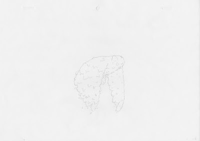
 but using an owl flying sequence instead. Wing created the outline frames for the owl flying then we each did three frames in the cycle which was then put together with some hand drawn type. Here are my 3 drawings for it:


No comments:
Post a Comment