This afternoon I took part in a photography induction which showed us the basic in using a Dslr camera. The main points we covered were: resetting/formatting, using; aperture, shutter speed, iso and white balance. I'd used a Dslr previously during one of my foundation projects so I new about a lot of the points talked about however I had never used a canon camera before so I learned a lot about how to use them which was really useful. I really enjoyed experimenting with photography especially when I had been taught a few tools to play around with. Started by going around the college experimenting just with the aperture and the shutter speed (first four images). Then we all went into a studio to set up lighting rigs and black/white backgrounds to photograph object we brought in. This was an opportunity to experiment with lighting, tripod, aperture, shutter speed and white balance (last four images).
1st photo I increased the F stop slightly and used a very quick shutter speed to get the image dark but not too noisy.
2nd: I used a very slow shutter speed (around 1/4s) and moved the camera to get some motion blur
3rd: Used a fast shutter speed and a slightly lower F stop creating a darker photo with some depth of field
4th: I used the lowest F stop I could to get an exaggerated depth of field
5th: Testing using the lighting rigs
6th: Used a slightly slower shutter speed to get bit more detail whilst trying to not overexpose
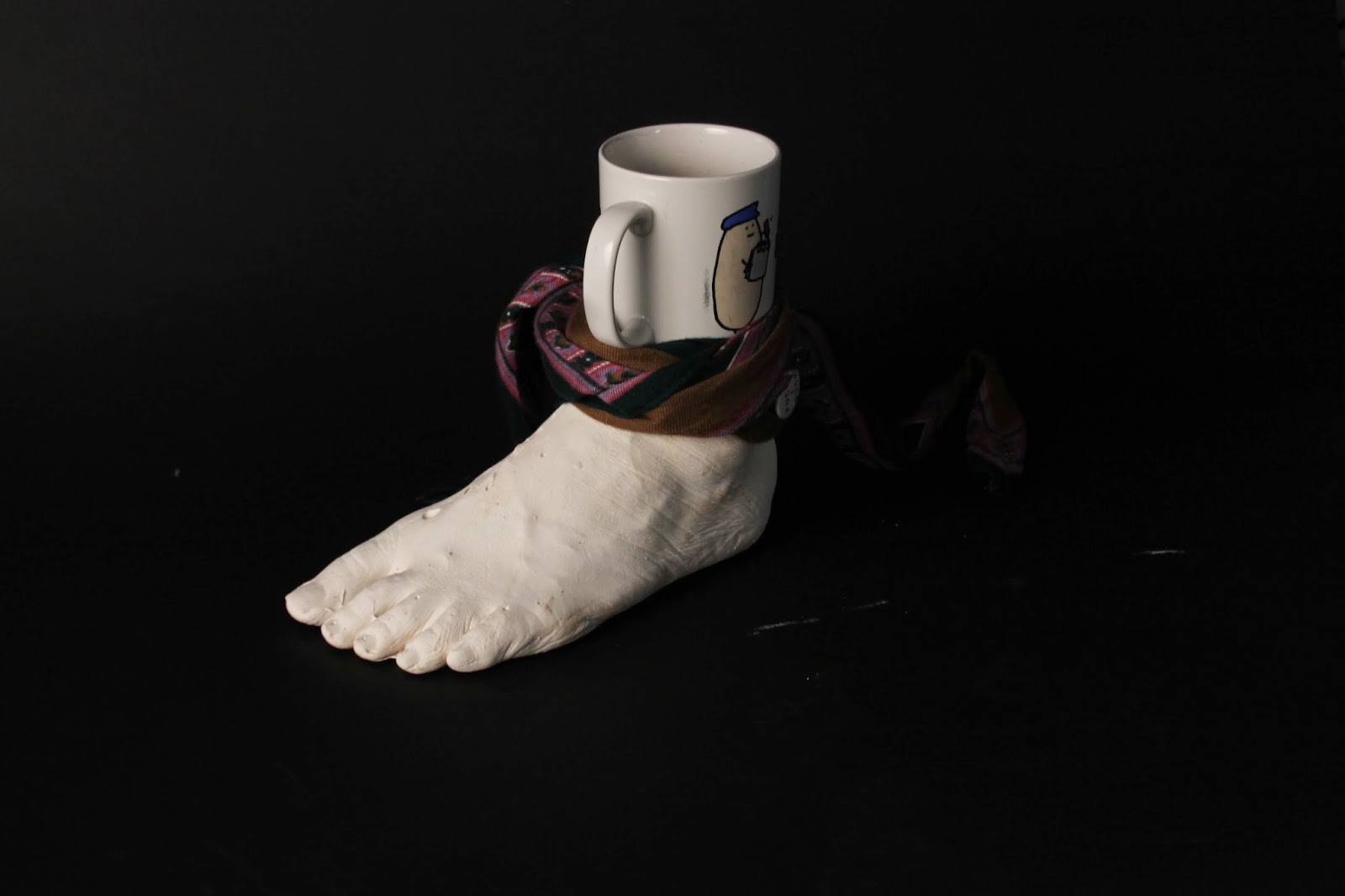
7th: I used a low f stop and a fast shutter speed to try and get good depth of field
8th: Gif made up of a set of images with the shutter speed slowing down


.JPG)