Sunday, 27 March 2016
responsive final animation
Once I'd finished the final animation I sent it to ollie to do the sound. I was really happy with the end result and think we all worked well together as a team producing what I thought was a pretty professional looking animation. Role in the project never particularly had to be formally set everyone just new what they needed to do and knew when the needed to take charge making it a very nice dynamic. I hope to work with the people again in the future.
Responsive: constructing the final composition
Once all the animation was completed the last thing to be done in after effects was to put it all together, which was quite a task. I started by setting up the entire background so all the sections where easily accessible for quick changes, which often meant decompressing pre-comps. I then used the composition flowchart to navigate between everything. Most of the animation could be placed on top of the moving background however somethings like the roller coaster needed to be placed deeper in the flowchart of comps. The most difficult part of putting it all together was working out the camera timings, I tried to stick to the animatic as best as I could however some of the transition times where not realistic. I added a lot of easing with the camera to make the movements more natural and less jarring. I worked through the entire animation scene by scene adding all the character animation first then adding additional assets (fish and moving background pieces). The layout of the background and the animation being rendered how it was made this task much smoother. One minor problem I encountered was due to the large size of the background and all the files my mac struggled when working with all of it, I'm sure there must be some settings which ignores of things off screen to cut down ram preview times.
I put together my first edit then sent it though to the others for feedback so I could fix any mistakes I missed or change anything people thought could be better. I wanted to do it this way so it only needed to be rendered once more and didn't need altering once it went into the sound edit.
Saturday, 26 March 2016
responsive: final crit
The responsive final crit was not quite what I was expecting but was useful in terms of presentation skills. I did not realise the layout of our presentation boards should be more informative that the previous crit and that the main focus of the crit would be on how our boards where presented. The layout of my boards was generally well received however my boards lacked a lot of information so people where confused on what briefs I had done and why. I now know for when I construct my final boards that I will need to include a lot more information about what the brief I did were. I was a little disappointed about the crit as I thought I would get more feedback on the work itself this would as this would be helpful both for my evaluation and also for general self improvement. I created boards for my 3 personal briefs and my collaborative one. I also played a personal animation on my laptop and a video showing all the completed animation for the unfinished collaborative brief.
responsive: testing comping
Before I knew it would all work putting everything together I needed to test my theorys on how it would all work. The plan was to have one big background and use a camera in after effects to move through it. I hadn't used a camera in after effects for a while so I had forgotten a few things about it. The main was that when moving across 2D layers in a flat way you must move the point of interest and the camera at the same time which needs to be done in the top view. If this isn't done you get weird fake 3D effects which ironically makes the whole project look incredibly flat (in a bad way). A problem I did come across was having to zoom in on the boat which was rasterised file didn't work nicely as I needed a vectorised version. Once I knew the camera worked fine it meat the project could continue as planned.
responsive: cart animation
Animating the cart in the animation was quite difficult purely from a timing point of view. The cart needed to follow the camera panning at the same speed. The first time round I animated it to the exact timings of the animatic it was however changed slightly when it came to the final composition.
responsive: angler fish
The next main scene I went to animate was the angler fish light bulb change at the end. Since I had the diver before the angler fish I started doing the scene before the angler fish was ready. I substituted the fish with a simple shape layer so I could animate the diver. Once the angler fish was ready I just dropped it into the comp and animated it with the diver. The scene was relatively straight forward however the only new thing was creating a lighting effect for the bulbs. I decided to use repeating circles for the lights which I then parented to the angler fish with the anchor point on the bulb so the light always moved with its source. I wanted the light to flicker a little but I wasn't to sure how. I then found out the wiggle expression works with opacity as well as with position, so I added a slight wiggle to make the light flicker a little.
responsive: making MSC idents
At the start and end of the animation we wanted the MSC logo prominent as we were essentially making an advert for them and they are all about there blue eco label. We wanted the logo animated as we felt just started with the static logo would not be very engaging. I personally found the label itself not very attractive which made it a much greater creative challenge to work with compared to animating with some more aesthetically pleasing type. My first idea was to have the logo bubble on screen. I wasn't sure how to do this so I experimented with it in after effects for a bit.
This was the final outcome and after some feedback I realised it wasn't great and wouldn't really fit with the target audience very well. I tweaked this piece original but figured it would better to start from scratch. I realised we had all of these really nice fish designs created by Tom and this could be a great way to showcase those and show that the MSC main focus is on fish. I cut up the MSC logo in photoshop so I had separate animatable assets and then made the fish flicker between all the designs until they seamlessly turned into the MSC logo. I brought the logo in using the stroke effects and opacities.
I wanted there two be two separate idents for the animation because I felt it would look a bit stale to have the same one twice and having two animation of the same logo would make it stick in peoples heads better. I wanted to do something that looked a bit more hand done as I felt the aesthetic of that would be good for the target audience. I played with some textured brushes in photoshop to find something that could work well. I wanted to have waves acting as a mask to reveal the logo but only wanted the animation where the logo was and no where else. I tried a few wave animations too see what worked and I ended up using a combination of the two different attempts which created the final version.
responsive: animating a full scene
At this point in the project I had only animated small sections to see how they would look but they were only small parts of the animation. The next section of animation I needed to tackle was much longer, which was the opening scene which featured two of the divers. I ran into a few problems during this section however everything was simple enough to fix. The way we wanted to put the final piece together would be on one massive composition in after effects. Since the background was so large we wanted as many pre-rendered assets as possible. That meant the diver animations needed to be in the exact right places so they would be able to interact with the background seamlessly. The first part of the scene I started to animate was the diver jumping off the boat. I placed the boat from the main background into my diver comp and created a blue solid to show where the water would be. I was essential that the boat and water were the exact same distance apart in the final comp. Again I looked a lot of reference footage of divers jumping from boats. Another challenge that came up was animating the splash. I used some animation I saw on my summer internship (from a show called messy goes to okido) where all the fx animation is done in aftereffects to get reference for my splash. they use very flat rising and falling shapes to create splashes and it works very well. I did the same with shape layers however I also deformed the start and end to make them appear more natural.

(ref found at 11 seconds)
Another difficulty I ran into was lining up two separate pieces of animation. It would be very difficult and often something goes wrong when copying keyframes of a big movement across so I thought it would be simpler to line up the end of one piece of animation with the other so they appear seamless. I did this by changing the blending settings in after effects to difference this allows you to clearly see where they overlap is. The aim was to have as much overlap as possible. The final result worked really well and you could not tell two animations had been stitched together.

The last issue I ran into during this scene was a problem with duik. I was unable to horizontally flip a character when it was rigged up that would have to be done on the comp'd animation. There may have been a solution using duik possibly with some kind of mast controller. I decided to just animate the female character separately and place the animation in as a comp which I could then flip so it would face the male diver.
Responsive: running diver
After getting the green light on the swimming animation I knew what I was doing with the divers was ok and proceeded with the rest of the animation. I made a list with ollie of all the animations that needed to be done for all the scenes and divided up the work. The next piece of animation I wanted to try was the diver on a treadmill. I'd never done a run cycle before this however it was a much easier task than the swim cycle as I could use the animators survival guide for reference rather than having to use live action footage. I started by animating the legs and body pose to pose. There were 7 key poses on each side totalled to a 14 pose loop. Once I'd done that I adjusted timings and small tweaks either to the motion paths or the speed using the keyframe graph editor. Once I was happy with the legs and body I did the motion of the flippers, arms and head. This was much quicker to animate than I thought it would be and I was very happy with the results.
responsive: swimming divers
The first thing I thought I should start trying to animate was the diver swimming. I knew there'd be a few scenes with divers swimming so this seemed like the logical place to start. I looked at a lot of reference footage of real life divers however they did not swim at all how I had pictured. I assumed there would be a lot of leg movment involved however a lot of scuba diving movement seems to be pretty passive. The kind of hollywoodesq diving I was picturing was hard to find except for I remembered that James Bond definitely had some featured in some of the films. After talking with a tutor I found an underwater battle from the film thunderball which had loads of great reference footage.
This was the first swim cycle I produced. I was unsure about it and other I showed it too were also unsure. The problem was the movements where too cyclic and were not exaggerated enough so it did't look like the diver was pushing off against anything. I kept tweaking the swim cycle and slowed it down to create the final result which I was very happy with. I also experimented a little doing head turns which look 3D using the liquify effect. I had learnt how to do it for a previous responsive brief and thought it could add a nice touch of character to the animation.
responsive: rigging again
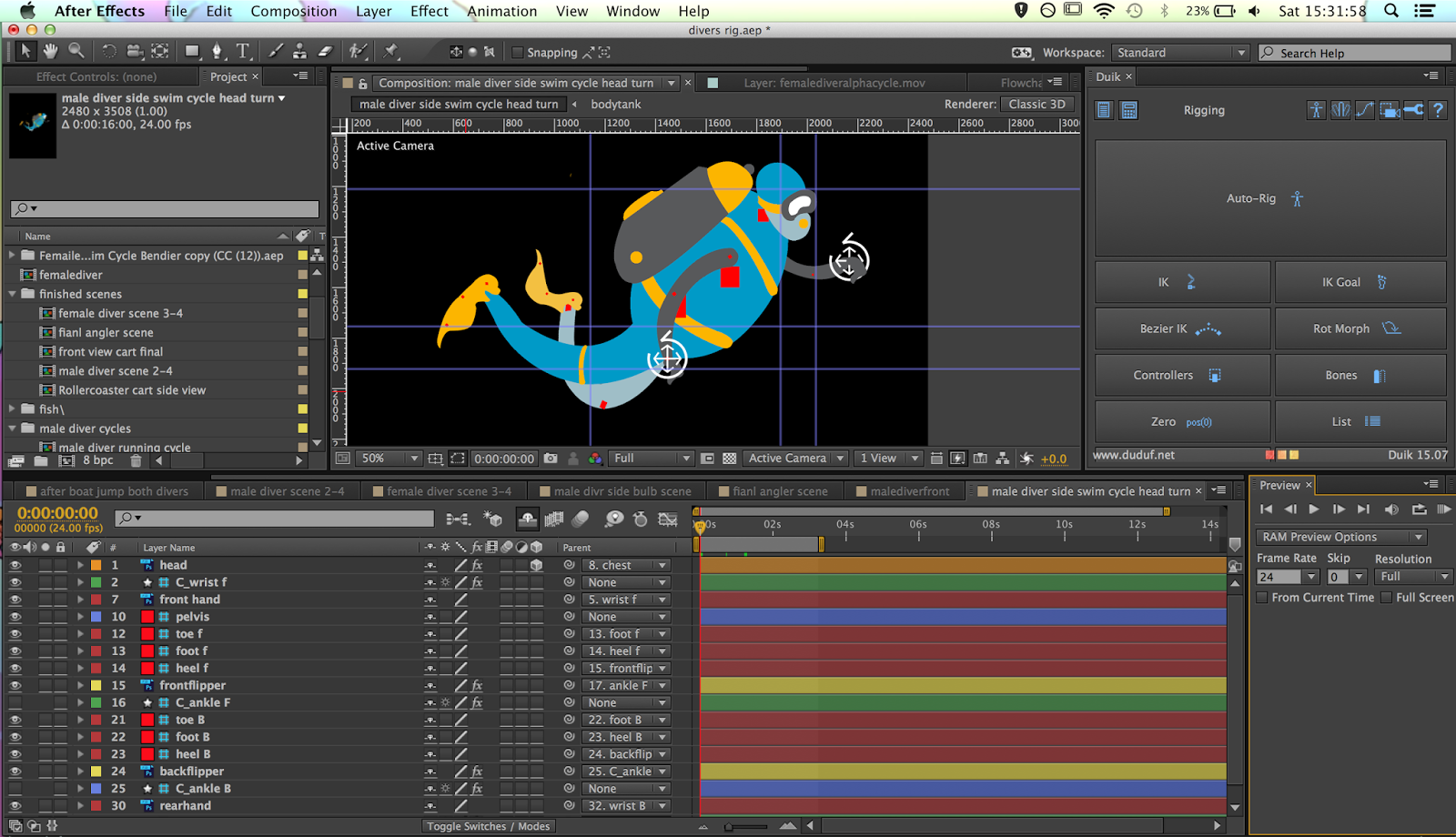
After all the preproduction was done all I could do was help oversee the design work until it was ready. Once the divers where finished by tom I was then able to start rigging them up and doing some animation tests. I used a external plugin in after effects called DUIK. I'd used it for previous projects so I knew what I was doing with it and the rigging process was very quick compared to other times doing similar projects. I was very happy with the characters tom made they were really nicely laid out and allowed me to very cleanly rig the characters with as few a layers as possible.

Once the character was all working I was able to give the sign off that the character design was finished and could begin animation tests.
responsive: making the animatic
Once we had the initial idea ollie went to lay it out on storyboards. We had planned the animation to be one continuous shot on a large background, however every main shot needed to be planned. I then took the story board and worked it into the animatic. The main focus of the animatic was the transition times in the animation. Since there where no actual cuts in the animation I had to try and make it as obvious as possible how it was transitioning. Another important part of the animatic was the timing of the animation with the voice over. We wanted a narrated voice over to tie our animation with the MSC cause. Ollie and I worked up a script from the treatment and storyboard for me to work from. I then recorded my own version of the narration to use in the interim in the animatic. I think if I was going to do a similar project again I would have the storyboards done of a mock up of the long background so it could show the proper transitions.
responsive: msc mood boarding and approaches
Once we had the idea in place we could start delegating tasks for people to do. Ollie and I took roles to do with the filmmaking (scripts -> animatic) and the hattie and tom took more of the design side of the project. It was important that because the project was being designed by two people it was important that it all fit together. Ollie and I created mood boards to give them both the general ideas of what we wanted for the animation. I created the mood board for the backgrounds I wanted simple graphic like design but with with more detail than the standard motion graphic. It was likely that the characters would be very simple so I wanted the background to have more texture to them.


responsive: forming ideas for the MSC
Our first meeting mainly consisted of a big mind mapping session between everyone. We all tried to formulate a plan about how we would approach this project. We knew what the brief wanted but we also wanted to make sure or response could play to individual strengths to make the final outcome as strong as possible. In our first session we found the confines of the initial brief really difficult. We were all trying to pitch ideas which generally did not fit the brief either what the MSC asked for or what "the aspirationals" would find engaging. The first session ended with no viable ideas coming out of it. After meeting again in a more relaxed environment everything went a lot smoother, I think having more time to think and being in a environment with less pressure helped the ideas flow much better.
We ended thinking of creating a infographic styled animation but instead of just stating facts like most which is very dry we wanted to make something a lot funner. A big inspiration pitched by ollie was an advert for the video game portal which was the exact tone we wanted in our video.
We ended thinking of creating a infographic styled animation but instead of just stating facts like most which is very dry we wanted to make something a lot funner. A big inspiration pitched by ollie was an advert for the video game portal which was the exact tone we wanted in our video.
Using a more motion graphic like style I knew we could use 2D rigged characters to animate with which would allow everyone to do well for this brief. I'm fairly confident with aftereffects and the others where confident in designing in illustrator and photoshop. This meant they could both create characters and background which would not be altered at all when animated.
responsive: dissecting the MSC brief
During our first collaborative responsive meeting we knew it was important to know what we actually needed to do to fulfill the MSC brief. We went through the brief thoroughly and found keywords that needed addressing in our brief. The main points we picked out was that the video created needed to positive (they were very adamant to not have anything negative) and that the video needed to be around 30 seconds. Our target audience was fortunately laid out for us they had a specific group of people they wanted the video aimed at. They were dubbed "the aspirationals" who are 18-25 year olds who are conscious consumers. These people are drawn to new things based on how they look but also if they are more considerate (for example; fair-trade or better for the environment). This was a great help that we were given such a specific target audience as it allowed us to narrow our scope on what we were going to do with our 30 seconds.
responsive: dissecting a brief
During a responsive session we all had a seminar on dissecting briefs that are given by competitions, this is an important skill because these are situations where there isn't a representative to explain what they are looking for so often requires so reading between the lines. We took past D&AD briefs and analysed them the best we could to find what they wanted in response. The most important thing I took away from this seminar was the importance of keywords. The best way to dissect a brief is to find the key words highlighting both the ethos of the brief and also the direction of what the brief is asking for.
Another important aspect was reading beyond the brief. This was seeing how you could go beyond what the brief has asked for instance even if they haven't asked for an animated entry doesn't mean it couldn't work really well for it.
Another important aspect was reading beyond the brief. This was seeing how you could go beyond what the brief has asked for instance even if they haven't asked for an animated entry doesn't mean it couldn't work really well for it.
Tuesday, 1 March 2016
applied: technical tests
We wanted to use water colour in our animation to illustrate the imagination of the child when stories are being told from their perspective. I had used track matts in after effects once before this project and thought it could be an effective tool for animating either digital or real watercolour. I did the first test with some simple digital water colour and some black frame by frame animation over the top. Using a luma matt which makes black into a mask it created a nice colouring effect which was controllable using frame by frame animation. This also meant I could use a wide range of textured brushes for the colouring which gives it a little more character.
I then tried the same technique but with one of the storyboard panels I tried a few different animating approaches.
applied: animatic
Once the thumbnails had been created Lauren and Wing created the final rendered storyboards. I asked for them to be done digitally because it would make the creation of the animatic a lot easier and allowed a lot more control with the animatic. Before I could start making the animatic it was important that I had some timing reference, so we all did some recordings of our script so I had something to work from. We each did one of the stories from our script which I then worked from. It was important to work from a sound track as we needed the visual storytelling to move at the same speed as the narration. An important part of the animatic that I wanted to get across was our use of transitions. We wanted to add some character to the line in the animation which would flow between scenes in interesting ways and this was hard to get across in the storyboards so I used masks and the effect stroke to show these transitions in the animatic.
applied: storyboarding
we first started storyboarding on post it notes using the designs wing created and the script. I normally storyboard this way as you can easily add, move and change the shot you've boarded. We had a rough Idea of the entire film and got some feedback from the tutors which came back saying it needed some editing. Some of the shots were not helping the story and others could have been more effective if slightly altered. They suggested using a thumb-nailing method where you storyboard on one page using very small boxes for each panel. This was a much better way of laying it out and a method I had not done before. It allowed us to "read" our storyboard much easier to see if it made sense and that the shots helped tell the story.


Subscribe to:
Comments (Atom)