Once all the titling was complete and I had the sign off on all the footage/sound the film was ready. I was really happy with the final product although of course a few things could have been done differently it turned out great and I had a very good team. Communication throughout the project was very good which I think helped the success of the us as a group and the project as well.
Saturday, 7 May 2016
Titling and idents
It's important for the professional look of the film to have good titles and idents. For the titles I used a nice "hand drawn" type and then to give it a bit more life I gave it a little wiggle in after effects. I used a displacement map on the text hooked up to a fractal noise layer to make the text move slightly. This made sure the text fit in with the rest of the hand drawn aesthetic of the animation. I did idiotically spell Lauren's name wrong but fortunately since I kept sending the work back and forth it was quickly corrected.
For the college logo I thought it was a bit plain to just have the black and white logo in the animation. I downloaded a copy which had a transparency layer which was very useful as it meant I could use a trk mt with it. I composited one of the water colour backgrounds in with it to make it fit more with the overall composition. For the opening logo I wanted it to be a little more animated so I took a series of water colour splatter brushes in photoshop and layered them up with a track mat to have a similar effect. It gave a nice playful look to the whole thing and felt it made the piece look more professional.
As a group collective we needed to represent our selves at the start of the animation like most production companies do. We had labeled ourselves team OWL so we went with that. I had an idea that we could produce an ident were we all pitch into the animation and create something like this: but using an owl flying sequence instead. Wing created the outline frames for the owl flying then we each did three frames in the cycle which was then put together with some hand drawn type. Here are my 3 drawings for it:


For the college logo I thought it was a bit plain to just have the black and white logo in the animation. I downloaded a copy which had a transparency layer which was very useful as it meant I could use a trk mt with it. I composited one of the water colour backgrounds in with it to make it fit more with the overall composition. For the opening logo I wanted it to be a little more animated so I took a series of water colour splatter brushes in photoshop and layered them up with a track mat to have a similar effect. It gave a nice playful look to the whole thing and felt it made the piece look more professional.
As a group collective we needed to represent our selves at the start of the animation like most production companies do. We had labeled ourselves team OWL so we went with that. I had an idea that we could produce an ident were we all pitch into the animation and create something like this:
 but using an owl flying sequence instead. Wing created the outline frames for the owl flying then we each did three frames in the cycle which was then put together with some hand drawn type. Here are my 3 drawings for it:
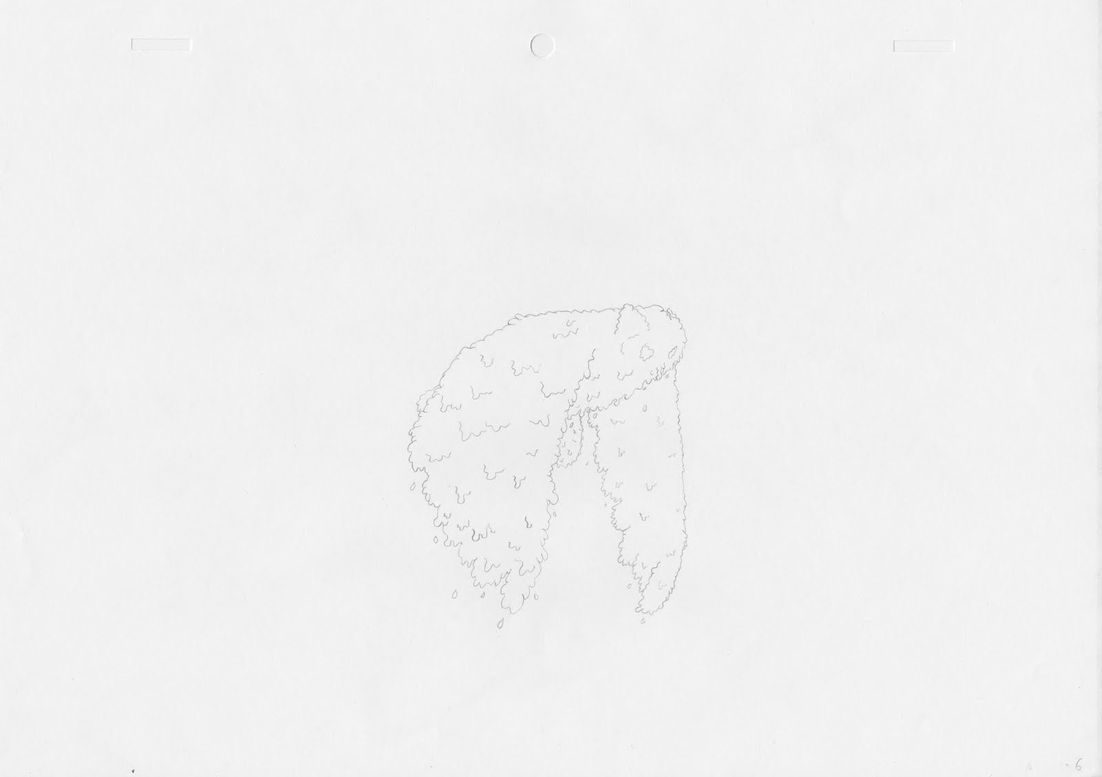


Getting sign offs
Once I'd done the "final" edits I kept sending the changes through to the group asking for feedback n it. Any changes to sound and the video were open so I could fix any problems I missed. I wanted the animation to be nicely polished and am aware that I could easily miss things or think some sounds may work better than they actually do.
This proved really effective especially when I stressed that I wanted criticism on it I got good feedback to help me improve the edit further. This is definitely something that should be done with all group work.
This proved really effective especially when I stressed that I wanted criticism on it I got good feedback to help me improve the edit further. This is definitely something that should be done with all group work.
The premiere edit (sound)
Once all the sound a compositing was completed I could move on to the final edit. I was unsure how many sound effects were needed but I didn't think it would be many. The first edit was just with the narration and the animation seemed to lack a lot of impact, it was definitely missing something. I added a series of sound effects for things that were going on in the animation but the sound still seemed vary sparse and there were quite a few silent sections that were very jarring. I thought it would be a good idea to put sound to the animated pencil lines and colouring as this made up a lot of the quite sections in the animations. I couldn't ind any goo pencil sounds online so I recorded a range of pencil sound fx myself. This worked out really well and I think it definitely gave the piece what it was missing.
Voice recording MK2
We had a set of voice recording from our group made so we could establish the animatic timings but they were not as good as they could be and the narration was an integral part of our animation. We should have done this before we started production but we didn't manage to before easter by which time we had to start production as it was three valuable working weeks. For future project I will make sure final voice recordings are a number one priority.
We got a variety of people to voice act for us and got them to do multiple scenes from our animation we tried to get as many as possible to do it so we had a good range to choose from. We showed them the animatic before hand with the original recordings to try and replicate similar timings. I was happy with the results we got from the session and they were much better than the ones used in the animatic.
We got a variety of people to voice act for us and got them to do multiple scenes from our animation we tried to get as many as possible to do it so we had a good range to choose from. We showed them the animatic before hand with the original recordings to try and replicate similar timings. I was happy with the results we got from the session and they were much better than the ones used in the animatic.
Putting all the edited footage together
I wanted to export each story separately from after effects but in no smaller pieces as I felt it would cause problems in premiere. I was also rendering the videos out as lossless files so I didn't want lots of massive clips. To make sure everything was edited correctly I put the animatic into the final comps of the 3 stories to make sure the timings were the same. In some places I increased lengths of video when I felt it was needed. A lot of the clips required holds to make sure they were the correct lengths so I just grabbed the final frames and put them at the end on the image sequences. This was a lengthy process because I had to go through many pre compositions but the flow chart in AE really helped. This method was nice an easy when it came to editing because there were only 3 videos I needed to re-render if changes where made so there was little room for confusion.
Colouring the animation
Colouring the animation was a fairly straight forward task since the technique was already established in the pre production phase. Each scene with colour needed to be filled in frame by frame to then be composited in after effects using track mats. This was fairly easy to do just a little time consuming.
A problem I noticed when I composited the first colour was that I hadn't used proper water colour paper. The texture of the colouring and paper was not very nice and stuck out from the main background. I went a brought some actual nice water colour paper and the results were much better.
Another problem I encountered was having two separate colours with this technique. I was unsure how this would work as I couldn't try to have two colours in the track mat background as the animation moves over the still. I figured out I would have to colour the separate parts of the animation twice if I wanted two colours. This would allow me to set up two separate tracks mats afterwards.
We wanted the colour to feel realistic (like it was actual water colour) so I used the custom brush I developed previously during the experimenting phase of the project. I used this when the colour was brought into a scene to make it seem more natural. Using the angle jitter settings I made sure each brush stroke looked different. To keep the colour in the lines I tested between just rubbing out overlap and trying to colour using the selection tool. The problem with the selection tool is it often left very hard edges which looked very out of place.
File organisation
Although this seems like a boring and straight forward task when doing post production on a project like this its vital that files are organised properly especially in the after effects project file.
Since I ended up having over 300 differently files including frames and colouring to work from it was really important I knew where everything was. I used lots of folders in the project panel to organise everything and also made sure all folders things were rendered too were labeled.
 A really useful tool I like to use a lot to make sure everything was in the correct place is the after effect flow chart. This function allows to see which compositions are in which and what things precompose into.
Since I ended up having over 300 differently files including frames and colouring to work from it was really important I knew where everything was. I used lots of folders in the project panel to organise everything and also made sure all folders things were rendered too were labeled.

Masking problems
Masking is an important part of the post production it allows backgrounds and overlapping animation to blocked out, they generally make the animation look more polished overall. The problem with the channel effects is they prohibit masking as they are already turning things to transparency. To get round this I needed to precomp all layers that required masking and make sure the effects where inside the precomp so they don't effect the mask. I'm glad this was a relatively quick fix.
animating in post
Some scenes seemed like they would be a waste of time to animate on paper as it wouldn't look any better. I laid out all the possible things that I could animate in after effects rather than on paper and then Lauren and Wing could decide which scene where not worth doing by hand. Scene like the cracking scene:
where animated using the stroke effect, its fairly simple to use just requires some attention from the pen tool to create a lot of masks. Wing draw the original cracks a few times so it looked more like it had been all animated by hand. I think the effect worked really well and definitely saved some valuable production time.
The stroke effect was also use to transition some backgrounds, as sometimes it was a little jarring when the scenes just completely changed to a solid background I use stroke to help them transition in.
Another section that was done in after effects was the bus driving away, it would be an overly lengthy way to do it by hand so I was just able to control its position and scale in AE.
Starting production
Wing and Lauren took the bulk of the production as they were more confident with traditional animation and I was going to do all the post production. I did however want to do some production as I wanted to practice my animation skills.
I animated 3 storyboard panels from scratch on paper. I found some of it to be quite challenging I had not done any paper animating in a long time and struggled with out being able to preview my work like you can digitally animating. Although I realised paper animation was not for me I felt like its a good challenge as an animator and I should try more in future as it really improves both drawing and animation skills.
I found staying on model quite difficult. I realised however that keeping the original designs in front of me helped a lot so little details wouldn't go missing.
It was nice working on a project like this as there are often things I would normally try and avoid as an animator but this pushed me out of my comfort zone especially the scene where the bear climbs over the fence as the angle on the bear keeps changing although it could have been better I'm happy with my efforts and felt I improved along the way.
Starting post production
Starting post production needed to happen as soon as possible as I knew I had a lot to do and normally not much time is allocated to the job. I asked that all frames were scanned and uploaded to the drive when they were completed which meant I could start working on them right away. All the footage given needed to be edited so they would work with the same background texture and colouring. I used the same tested technique as before using a combination of 4 channel effects I turned white to alpha. The problem was that there where often marks on the pages which would come through which didn't look very nice. I added a levels adjustment which had to be on to of the other 4 effects to work to tweak how the pencil lines looked and to remove some of the speckles that appeared. Although a lengthy process I still feel this was the best way to do this to get the best looking results however there may be better techniques I am unaware of.
Post production proof of concept
After our final crit where I was quizzed on whether my theorised post production methodology would work I went and tested it. I had learnt from previous project that by using a combination of 4 channel effects in after effects that you could turn white into an alpha channel. This would allow background texture to be put into the animation with ease and animation to be layered up. I then experimented with some paper texturing in the background to see what it looked like. I was pleased with the overall look as was happy to give the go ahead that post would work. Here is the test I did for the post production techniques:
testing digital animation
At the start of the project although we wanted to try to get a traditional look to the animation were unsure about whether we wanted to do it digitally or with paper. In the end we went for paper as it was preferred by a majority of the group. I did a quick digital test of the bear before hand to see what it would be like to animate the characters in photoshop. I was told the animation style was too vectorised which isn't something I had thought about before. Since we were going for a hand rendered look to the piece vector style animation would really stick out. Here is the quick test I did:
Friday, 6 May 2016
Rough designs
Before the final character design process we all discussed how we wanted it all to look aesthetically and then went away to do some initial sketches. In the end we agreed wing had created the nicest designs and needed to develop them further for the project. Here are a couple of sketches I did before hand.


I took some influence from the comic artist Bryan Lee O'Malley. I felt like I struggled during this process the style of drawing we were
going for was quite different to what I'm used to but I gave it a go anyway. I definitely need to become a more versatile artist.


I took some influence from the comic artist Bryan Lee O'Malley. I felt like I struggled during this process the style of drawing we were
going for was quite different to what I'm used to but I gave it a go anyway. I definitely need to become a more versatile artist.
applied: preproduction crit
The crit went well and fortunately we were prepared for it. It was useful to get feedback but also a sign off on the ideas we wanted to animate and how we were going to animate them. Some things we hadn't really thought about or needed to do where raised during the crit. One was that we hadn't really thought about what we were going to do about sound. We decided that we would use a range of sound fx but not have any music in the animation. We also needed to complete some look tests although people where happy with our colour and line tests we needed to finalise how the finished product would actually look.
Now that we know what we need to press on with and can all do so as a group.
Now that we know what we need to press on with and can all do so as a group.
applied: research
A lot of research was required before doing this piece mainly to see how different techniques would come together and how other animators have used them. My first place to look was the tales of princess kagua unlike other studio Ghibli films the stylisation of this film was far looser compared to the often semi real works from the studio. There is amazing use of colour and mark making which makes the animation incredibly expressive. I wanted to have some similar mark making in our film that wouldn't just look nice but help tell the story as well. A good example of this is when the main character is very upset and starts running the animation get looser and messier which really helps bring out the tone of the whole scene whilst still being visually stunning.
Short animation piece using water colour nice to see how they used the medium. It definitely came across as a less is more situation. Can have a lot more appreciation for the media if the negative space of a page is utilised.
https://vimeo.com/1507264525 Dylan carter's work uses very simple colour and traditional line work. there is a lot of negative space used in his work which interested me a lot. It was very traditional and digital mixed up which I thought worked really well and hoped to apply to this project.
Short animation piece using water colour nice to see how they used the medium. It definitely came across as a less is more situation. Can have a lot more appreciation for the media if the negative space of a page is utilised.
Ernest and Celestine is a traditionally animated film. The overall styling of it is really beautiful and carries a juvenile air to it through its loose lines. A thing I definitely took from this is that production doesn't need to be full 24fps all the time all of this is done on twos and often even slower for some situations frames are often held but it still works really well. Working like this would be much more beneficial as it would allow more time to ensure work is to a higher standard.
applied: getting stories from the public
Before we could start any of our planning (storyboarding, animatic ect) we needed our script. Since we wanted real life stories we needed to go out to the public and try and get as many stories as we could so we had a range to choose from. We came up with a questionnaire to send out to people via email and social medias.
Here is the questionnaire:
For my current animation project I'm collecting stories where parents have to tell their children white lies to cover big or difficult issues. If anyone has any stories relating to the following questions or can show them to people who could answer them (as they are aimed at parents):
-How did you explain to your child when a family member or pet passed away?
-How did you explain to your child that they were getting a new sibling or cousin?
-A story to stop your child being a picky eater?
-What did you say when your child asked about a fairy tail?
-How did you explain to your child if they lost or broke something they loved (like a toy or teddy)?
Any answers would be really appreciated you can PM me any stories related or if you know anyone I could get in touch with it would be a great help.
I sent this to family and individual friends as well. It was harder than expected to get actual stories that were usable from the public. Waiting for stories became quite a time sink for the project.
Wednesday, 13 April 2016


Sunday, 27 March 2016
responsive final animation
Once I'd finished the final animation I sent it to ollie to do the sound. I was really happy with the end result and think we all worked well together as a team producing what I thought was a pretty professional looking animation. Role in the project never particularly had to be formally set everyone just new what they needed to do and knew when the needed to take charge making it a very nice dynamic. I hope to work with the people again in the future.
Responsive: constructing the final composition
Once all the animation was completed the last thing to be done in after effects was to put it all together, which was quite a task. I started by setting up the entire background so all the sections where easily accessible for quick changes, which often meant decompressing pre-comps. I then used the composition flowchart to navigate between everything. Most of the animation could be placed on top of the moving background however somethings like the roller coaster needed to be placed deeper in the flowchart of comps. The most difficult part of putting it all together was working out the camera timings, I tried to stick to the animatic as best as I could however some of the transition times where not realistic. I added a lot of easing with the camera to make the movements more natural and less jarring. I worked through the entire animation scene by scene adding all the character animation first then adding additional assets (fish and moving background pieces). The layout of the background and the animation being rendered how it was made this task much smoother. One minor problem I encountered was due to the large size of the background and all the files my mac struggled when working with all of it, I'm sure there must be some settings which ignores of things off screen to cut down ram preview times.
I put together my first edit then sent it though to the others for feedback so I could fix any mistakes I missed or change anything people thought could be better. I wanted to do it this way so it only needed to be rendered once more and didn't need altering once it went into the sound edit.
Saturday, 26 March 2016
responsive: final crit
The responsive final crit was not quite what I was expecting but was useful in terms of presentation skills. I did not realise the layout of our presentation boards should be more informative that the previous crit and that the main focus of the crit would be on how our boards where presented. The layout of my boards was generally well received however my boards lacked a lot of information so people where confused on what briefs I had done and why. I now know for when I construct my final boards that I will need to include a lot more information about what the brief I did were. I was a little disappointed about the crit as I thought I would get more feedback on the work itself this would as this would be helpful both for my evaluation and also for general self improvement. I created boards for my 3 personal briefs and my collaborative one. I also played a personal animation on my laptop and a video showing all the completed animation for the unfinished collaborative brief.
responsive: testing comping
Before I knew it would all work putting everything together I needed to test my theorys on how it would all work. The plan was to have one big background and use a camera in after effects to move through it. I hadn't used a camera in after effects for a while so I had forgotten a few things about it. The main was that when moving across 2D layers in a flat way you must move the point of interest and the camera at the same time which needs to be done in the top view. If this isn't done you get weird fake 3D effects which ironically makes the whole project look incredibly flat (in a bad way). A problem I did come across was having to zoom in on the boat which was rasterised file didn't work nicely as I needed a vectorised version. Once I knew the camera worked fine it meat the project could continue as planned.
responsive: cart animation
Animating the cart in the animation was quite difficult purely from a timing point of view. The cart needed to follow the camera panning at the same speed. The first time round I animated it to the exact timings of the animatic it was however changed slightly when it came to the final composition.
responsive: angler fish
The next main scene I went to animate was the angler fish light bulb change at the end. Since I had the diver before the angler fish I started doing the scene before the angler fish was ready. I substituted the fish with a simple shape layer so I could animate the diver. Once the angler fish was ready I just dropped it into the comp and animated it with the diver. The scene was relatively straight forward however the only new thing was creating a lighting effect for the bulbs. I decided to use repeating circles for the lights which I then parented to the angler fish with the anchor point on the bulb so the light always moved with its source. I wanted the light to flicker a little but I wasn't to sure how. I then found out the wiggle expression works with opacity as well as with position, so I added a slight wiggle to make the light flicker a little.
responsive: making MSC idents
At the start and end of the animation we wanted the MSC logo prominent as we were essentially making an advert for them and they are all about there blue eco label. We wanted the logo animated as we felt just started with the static logo would not be very engaging. I personally found the label itself not very attractive which made it a much greater creative challenge to work with compared to animating with some more aesthetically pleasing type. My first idea was to have the logo bubble on screen. I wasn't sure how to do this so I experimented with it in after effects for a bit.
This was the final outcome and after some feedback I realised it wasn't great and wouldn't really fit with the target audience very well. I tweaked this piece original but figured it would better to start from scratch. I realised we had all of these really nice fish designs created by Tom and this could be a great way to showcase those and show that the MSC main focus is on fish. I cut up the MSC logo in photoshop so I had separate animatable assets and then made the fish flicker between all the designs until they seamlessly turned into the MSC logo. I brought the logo in using the stroke effects and opacities.
I wanted there two be two separate idents for the animation because I felt it would look a bit stale to have the same one twice and having two animation of the same logo would make it stick in peoples heads better. I wanted to do something that looked a bit more hand done as I felt the aesthetic of that would be good for the target audience. I played with some textured brushes in photoshop to find something that could work well. I wanted to have waves acting as a mask to reveal the logo but only wanted the animation where the logo was and no where else. I tried a few wave animations too see what worked and I ended up using a combination of the two different attempts which created the final version.
responsive: animating a full scene
At this point in the project I had only animated small sections to see how they would look but they were only small parts of the animation. The next section of animation I needed to tackle was much longer, which was the opening scene which featured two of the divers. I ran into a few problems during this section however everything was simple enough to fix. The way we wanted to put the final piece together would be on one massive composition in after effects. Since the background was so large we wanted as many pre-rendered assets as possible. That meant the diver animations needed to be in the exact right places so they would be able to interact with the background seamlessly. The first part of the scene I started to animate was the diver jumping off the boat. I placed the boat from the main background into my diver comp and created a blue solid to show where the water would be. I was essential that the boat and water were the exact same distance apart in the final comp. Again I looked a lot of reference footage of divers jumping from boats. Another challenge that came up was animating the splash. I used some animation I saw on my summer internship (from a show called messy goes to okido) where all the fx animation is done in aftereffects to get reference for my splash. they use very flat rising and falling shapes to create splashes and it works very well. I did the same with shape layers however I also deformed the start and end to make them appear more natural.

(ref found at 11 seconds)
Another difficulty I ran into was lining up two separate pieces of animation. It would be very difficult and often something goes wrong when copying keyframes of a big movement across so I thought it would be simpler to line up the end of one piece of animation with the other so they appear seamless. I did this by changing the blending settings in after effects to difference this allows you to clearly see where they overlap is. The aim was to have as much overlap as possible. The final result worked really well and you could not tell two animations had been stitched together.

The last issue I ran into during this scene was a problem with duik. I was unable to horizontally flip a character when it was rigged up that would have to be done on the comp'd animation. There may have been a solution using duik possibly with some kind of mast controller. I decided to just animate the female character separately and place the animation in as a comp which I could then flip so it would face the male diver.
Responsive: running diver
After getting the green light on the swimming animation I knew what I was doing with the divers was ok and proceeded with the rest of the animation. I made a list with ollie of all the animations that needed to be done for all the scenes and divided up the work. The next piece of animation I wanted to try was the diver on a treadmill. I'd never done a run cycle before this however it was a much easier task than the swim cycle as I could use the animators survival guide for reference rather than having to use live action footage. I started by animating the legs and body pose to pose. There were 7 key poses on each side totalled to a 14 pose loop. Once I'd done that I adjusted timings and small tweaks either to the motion paths or the speed using the keyframe graph editor. Once I was happy with the legs and body I did the motion of the flippers, arms and head. This was much quicker to animate than I thought it would be and I was very happy with the results.
responsive: swimming divers
The first thing I thought I should start trying to animate was the diver swimming. I knew there'd be a few scenes with divers swimming so this seemed like the logical place to start. I looked at a lot of reference footage of real life divers however they did not swim at all how I had pictured. I assumed there would be a lot of leg movment involved however a lot of scuba diving movement seems to be pretty passive. The kind of hollywoodesq diving I was picturing was hard to find except for I remembered that James Bond definitely had some featured in some of the films. After talking with a tutor I found an underwater battle from the film thunderball which had loads of great reference footage.
This was the first swim cycle I produced. I was unsure about it and other I showed it too were also unsure. The problem was the movements where too cyclic and were not exaggerated enough so it did't look like the diver was pushing off against anything. I kept tweaking the swim cycle and slowed it down to create the final result which I was very happy with. I also experimented a little doing head turns which look 3D using the liquify effect. I had learnt how to do it for a previous responsive brief and thought it could add a nice touch of character to the animation.
responsive: rigging again
After all the preproduction was done all I could do was help oversee the design work until it was ready. Once the divers where finished by tom I was then able to start rigging them up and doing some animation tests. I used a external plugin in after effects called DUIK. I'd used it for previous projects so I knew what I was doing with it and the rigging process was very quick compared to other times doing similar projects. I was very happy with the characters tom made they were really nicely laid out and allowed me to very cleanly rig the characters with as few a layers as possible.

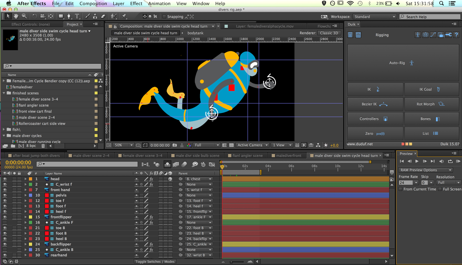
Once the character was all working I was able to give the sign off that the character design was finished and could begin animation tests.
responsive: making the animatic
Once we had the initial idea ollie went to lay it out on storyboards. We had planned the animation to be one continuous shot on a large background, however every main shot needed to be planned. I then took the story board and worked it into the animatic. The main focus of the animatic was the transition times in the animation. Since there where no actual cuts in the animation I had to try and make it as obvious as possible how it was transitioning. Another important part of the animatic was the timing of the animation with the voice over. We wanted a narrated voice over to tie our animation with the MSC cause. Ollie and I worked up a script from the treatment and storyboard for me to work from. I then recorded my own version of the narration to use in the interim in the animatic. I think if I was going to do a similar project again I would have the storyboards done of a mock up of the long background so it could show the proper transitions.
responsive: msc mood boarding and approaches
Once we had the idea in place we could start delegating tasks for people to do. Ollie and I took roles to do with the filmmaking (scripts -> animatic) and the hattie and tom took more of the design side of the project. It was important that because the project was being designed by two people it was important that it all fit together. Ollie and I created mood boards to give them both the general ideas of what we wanted for the animation. I created the mood board for the backgrounds I wanted simple graphic like design but with with more detail than the standard motion graphic. It was likely that the characters would be very simple so I wanted the background to have more texture to them.


responsive: forming ideas for the MSC
Our first meeting mainly consisted of a big mind mapping session between everyone. We all tried to formulate a plan about how we would approach this project. We knew what the brief wanted but we also wanted to make sure or response could play to individual strengths to make the final outcome as strong as possible. In our first session we found the confines of the initial brief really difficult. We were all trying to pitch ideas which generally did not fit the brief either what the MSC asked for or what "the aspirationals" would find engaging. The first session ended with no viable ideas coming out of it. After meeting again in a more relaxed environment everything went a lot smoother, I think having more time to think and being in a environment with less pressure helped the ideas flow much better.
We ended thinking of creating a infographic styled animation but instead of just stating facts like most which is very dry we wanted to make something a lot funner. A big inspiration pitched by ollie was an advert for the video game portal which was the exact tone we wanted in our video.
We ended thinking of creating a infographic styled animation but instead of just stating facts like most which is very dry we wanted to make something a lot funner. A big inspiration pitched by ollie was an advert for the video game portal which was the exact tone we wanted in our video.
Using a more motion graphic like style I knew we could use 2D rigged characters to animate with which would allow everyone to do well for this brief. I'm fairly confident with aftereffects and the others where confident in designing in illustrator and photoshop. This meant they could both create characters and background which would not be altered at all when animated.
responsive: dissecting the MSC brief
During our first collaborative responsive meeting we knew it was important to know what we actually needed to do to fulfill the MSC brief. We went through the brief thoroughly and found keywords that needed addressing in our brief. The main points we picked out was that the video created needed to positive (they were very adamant to not have anything negative) and that the video needed to be around 30 seconds. Our target audience was fortunately laid out for us they had a specific group of people they wanted the video aimed at. They were dubbed "the aspirationals" who are 18-25 year olds who are conscious consumers. These people are drawn to new things based on how they look but also if they are more considerate (for example; fair-trade or better for the environment). This was a great help that we were given such a specific target audience as it allowed us to narrow our scope on what we were going to do with our 30 seconds.
responsive: dissecting a brief
During a responsive session we all had a seminar on dissecting briefs that are given by competitions, this is an important skill because these are situations where there isn't a representative to explain what they are looking for so often requires so reading between the lines. We took past D&AD briefs and analysed them the best we could to find what they wanted in response. The most important thing I took away from this seminar was the importance of keywords. The best way to dissect a brief is to find the key words highlighting both the ethos of the brief and also the direction of what the brief is asking for.
Another important aspect was reading beyond the brief. This was seeing how you could go beyond what the brief has asked for instance even if they haven't asked for an animated entry doesn't mean it couldn't work really well for it.
Another important aspect was reading beyond the brief. This was seeing how you could go beyond what the brief has asked for instance even if they haven't asked for an animated entry doesn't mean it couldn't work really well for it.
Tuesday, 1 March 2016
applied: technical tests
We wanted to use water colour in our animation to illustrate the imagination of the child when stories are being told from their perspective. I had used track matts in after effects once before this project and thought it could be an effective tool for animating either digital or real watercolour. I did the first test with some simple digital water colour and some black frame by frame animation over the top. Using a luma matt which makes black into a mask it created a nice colouring effect which was controllable using frame by frame animation. This also meant I could use a wide range of textured brushes for the colouring which gives it a little more character.
I then tried the same technique but with one of the storyboard panels I tried a few different animating approaches.
applied: animatic
Once the thumbnails had been created Lauren and Wing created the final rendered storyboards. I asked for them to be done digitally because it would make the creation of the animatic a lot easier and allowed a lot more control with the animatic. Before I could start making the animatic it was important that I had some timing reference, so we all did some recordings of our script so I had something to work from. We each did one of the stories from our script which I then worked from. It was important to work from a sound track as we needed the visual storytelling to move at the same speed as the narration. An important part of the animatic that I wanted to get across was our use of transitions. We wanted to add some character to the line in the animation which would flow between scenes in interesting ways and this was hard to get across in the storyboards so I used masks and the effect stroke to show these transitions in the animatic.
applied: storyboarding
we first started storyboarding on post it notes using the designs wing created and the script. I normally storyboard this way as you can easily add, move and change the shot you've boarded. We had a rough Idea of the entire film and got some feedback from the tutors which came back saying it needed some editing. Some of the shots were not helping the story and others could have been more effective if slightly altered. They suggested using a thumb-nailing method where you storyboard on one page using very small boxes for each panel. This was a much better way of laying it out and a method I had not done before. It allowed us to "read" our storyboard much easier to see if it made sense and that the shots helped tell the story.


Saturday, 20 February 2016
responsive: brompton instagram campaign

I made a poster to stick around college to try and get people from all over the college to like it. I also asked a graphic designer I'm working with to give me some feedback on the poster just to make the layout more effective as this is something I know little about. The bottom poster is the final layout after feedback.

Brompton: getting feedback
I find after working on a project for a few weeks you start becoming blind to some errors or bits that could easily be made better so I always try to get feedback on my work both from tutors and class mates. The feedback was generally very positive however both tutor and student said that the character could be a bit more "animated" to give it a little more life. A couple of suggestions where to try and make the character look around and to have the character speed up and slow down. I didn't want to have to do any frame by frame animation as this would have stuck out a lot so i needed to find a solutions in after effects. The speeding up and slowing down was the easier task, I just used the time remapping function to alter the speed of a cycle. Since the animation was split into 2 second loops of the bike ride I could easily split one up. The second solution was a bit tricker and required futher research. I tried just moving the eyes and facial features but it didn't look right, I also tried tilting the head as a 3D layer but it made the head look very 2 dimensional. I found online a method which involved warping the head with the liquify effect which made it look like the head was moving slightly in one direction. By controlling the amount of distortion (from 0 - 100 %) I could have a gradual heat tilt in multiple directions which looked 3D. Adding these made the animation a lot more gave the animation a lot more character.
responsive: Brompton designing buildings
Once I'd animated my character I had to start designing the buildings for the background which was actually a far more important aspect of this animation. I knew I wanted the buildings to be simplistic however they needed to obviously recognisable from simple shapes. This would be both down to the design and also choosing buildings that are more recognisable.

I started by mood-boarding designs of buildings that I like but also fit the "graphicy" aesthetic I was going for in my animation. The hardest part of the design was establishing a colour palette for the buildings. I knew it was important that it wasn't the same as the character as you wouldn't be able to distinguish the character from the background. I figured the best this to do was go monochromatic, I found a particular shade of blue worked very well with the character however I was worried that just using blue would indicate it was night time. I asked a few of my peers and they advised that if I was only using light shades it wouldn't create a night time effect. I went with their advise and it was a good move. Below are all the buildings used in the animation;

Brompton: animating my character
I first started by rigging the whole character up. This was my second time doing a character rig in after effects so I had to re-learn a few things. I the most important part was the IK's in the legs, however I decided to also put IK's in the arms so if I wanted the to be any motion in the body the arms would move against the handle bars accordingly.


Once the character was all rigged up I placed the animated version of the bike in and animated the legs, then the rest of the body accordingly. I was really happy with how it turned out as I felt the motion look good especially since I'd never animated someone riding a bike before.
responsive: Making a Brompton
I started the designing with the bike itself. I thought the bike should look like a Brompton as this is whether it says so or not advertising for them so I'm sure they'd like to see their product.


I first tested how the bike would look to see if it would translate to animation how I'd pictured in my head. I then started on the harder task of designing a character, I knew there were certain limitations on the design since I wanted to rig it in after effects. This meant I had to design in a particular way to so that it would work for this. I wanted to design the character around myself so because its supposed to be about your personal city. I started with rough outline designs then selected a palette to work from. Since I'm not the best at creating palettes I searched many different works to find one which I thought would be suitable for this production. For the first time I started using Pinterest to help mood board, its a really great resource as the keyword function helps you find exactly what you're looking for.

Wednesday, 10 February 2016
responsive: Brompton brief
For my last personal responsive brief I chose a small competition being run by Brompton bikes. This brief was really appealing to me for a few reasons; the prize was a very nice bike (which would be very handy), a majority of the entrees would be filmed on phones so an animation would really stand out (giving me a good chance) and it would force me to have a good social media presence to win.
The brief asks for a video that is up to 15s long (this is the max time for instagram) which is about seeing your unseen city by bike. I don't own a bike in leeds so I knew getting live action footage would be tricky if I wanted to do so. As a student on leeds I thought it would be nice to show all the places that I go to on a regular basis for fun in leeds. Unlike film I have the advantage of being able to lay all these places out together as it may be a bit crazy if it was to cut to a knew building every second with live action film. Since it was for Brompton and a lot of the entrees contained one I figured it would be good to have one in my animation as I'm sure the brief as all about good advertising for them. A big part of the brief is to get lots of likes on your instagram video as only the top ten will get judged to win the 3 prizes. This meant I needed a plan on how to publish my animation effectively. I also needed to make sure that I get my animation finished with a good amount of time before the deadline which is 31st march.
I wanted some very clean animation for this brief and I figured a graphic style animation would hit their "hipstery" and minimal aesthetic well. I thought 2D character rigging would be a good solution with this as it can produce some very nice motion relatively quickly considering the deadline was quite tight and I've gotten aquatinted with it before. I was unsure what I want to do with the building design but I figured I'd tackle that after I'd designed the character.
responsive: choosing our groups
We had to make presentation slides to advertise our work and to show what work we're interested in to potential collaborators. I found it really difficult to select still pieces of work to best show what I could do also selecting artists as there were so many to choose from. I took down a few names of peoples work I really liked and ones who were interested in doing the same briefs as me.
When in came to meeting everyone I found a lot of animators where interested in working on the dazed brief after talking to a couple of illustrators I felt the other brief may have been better for me. I didn't want to work with a group that was a majority animators as this was an opportunity to work with new people. The group I ended up with forming was with a graphic designer, illustrator and an animator. This was a great group as we can have a very strong design team and have an ambitious animation because the work load can be split in half.
When in came to meeting everyone I found a lot of animators where interested in working on the dazed brief after talking to a couple of illustrators I felt the other brief may have been better for me. I didn't want to work with a group that was a majority animators as this was an opportunity to work with new people. The group I ended up with forming was with a graphic designer, illustrator and an animator. This was a great group as we can have a very strong design team and have an ambitious animation because the work load can be split in half.
responsive choosing a collaborative brief
Choosing a brief was quite a difficult challenge there were plenty of briefs that I found pretty repulsive however quite a few that looked interesting as well. The main things I looked for in a brief were ones I knew could be resolved through animation whether it was specified or not, I also wanted a brief that had messages I was happy getting behind. After looking through all the briefs I liked I narrowed it down to two briefs since it would be a bit easier to choose a partner.
The two i went for were the D&AD : dazed brief and the YCN: marine stewardship council brief. I chose the dazed one as I have had a big interest in mixed media animation and I thought this was a good opportunity to experiment with that also the brief was very open leaving a lot of room for experimentation. The MSC brief was appealing to me purely because it was a cause I believed in and it asked for a video response which meant the brief was more tailored to animation compared to others. I was torn by choosing on making a documentary on the environment so this was a good oppertunity to do something similar.
The two i went for were the D&AD : dazed brief and the YCN: marine stewardship council brief. I chose the dazed one as I have had a big interest in mixed media animation and I thought this was a good opportunity to experiment with that also the brief was very open leaving a lot of room for experimentation. The MSC brief was appealing to me purely because it was a cause I believed in and it asked for a video response which meant the brief was more tailored to animation compared to others. I was torn by choosing on making a documentary on the environment so this was a good oppertunity to do something similar.
Wednesday, 27 January 2016
responsive interim crit
This session was not how I pictured it being as it was useful in a way I did not intend it to be. I was unsure about some of my work as I tried to test some slightly different techniques and visual aesthetics for some of my work. I was expecting some criticism on my work to see what needed improving however there was none. I received plenty of feedback however it was all overwhelmingly positive. Although this did not give my anything to work with to improve my work it was a nice confidence boost. Going in to the room I did not feel that great about the work I had produced my responsive briefs however this session made me a lot prouder of my work. It was nice to see the kind of work the illustrators had produced as I was unsure what kind of work they were doing. I got some good feedback on my layout of my boards and will continue in a similar manor for future presentations.
Sunday, 17 January 2016
Applied: digital water colour tests

We discussed using water colour in our animations however there were some big issues surrounding doing so mainly material cost, if we did a 1:30 of animation it would be 2160 pieces of watercolour paper at 24fps. This would be very costly and over ambitious in the time period given. I suggested the possibility of using digital watercolour as an alternative. I hadn't done much of this before but I had been experimenting with brushes in photoshop a lot recently. I tried using the stock water colour brushes and also downloaded a few from the internet however noting produced the effect I wanted. I started to tweak one of the internet brushes in the brush settings. I found altering settings that involved jitter worked really well as the made the brush come out more randomly. I reduced the flow of the brush which preserved its texture a lot better.

Above was the result of the final brush I created I was very happy with the effect generated however the main thing I couldn't really achieve was the leaching you get when pigment gravitates to the edges of the brush strokes. I put a cartridge paper texture under the piece which made it seem a lot more realistic. I want to try and overlay some of the same texture of the top to give the piece more depth but haven't worked out how to do it effectively yet I'm sure there's a simple solution.
I then gave a quick test on using the watercolour in animation. I used some old line work to test out some colouring methods. I tried drawing frame by frame watercolour but I found it to be too crazy and messy it was not pleasant to look at. I then used some settings in after effects with track-mats which only show the animation through sections that are coloured and I used a continue fill effect to make the centre a solid colour to allow the effect to work. It produced some nice results which are worth exploring in future.
Applied: mood board
We all discussed what kind visual aesthetic we wanted to go for but all struggled to articulate what we wanted. There was a lot of talk about simple line work and possibly messier lines for the general animations. Then for the animation from the child's perspective we wanted some messier colour to really contrast with it and we all discussed using watercolour.
Fortunately when we all brought our mood boards into the next session we all had similar results from mood boarding and where all striving for the same visual aesthetic.

applied: finalising ideas
After a lot of discussion and thought we finally came do a conclusion on what we wanted to base our documentary on. We very much like the use of different media used to tell different stories in the animations we were shown so we wanted to have a few different stories in our animation not just the one. We started to focus on the different perspectives on the same situation from parents and children but we felt it was too general a subject to get answers from. We narrowed it down to the subject of parents telling their children white lies to cover big or difficult situations. We wanted to have stories such as a dog dying from the parents perspective which then morphs into a wackier child's perspective of the same event with narration from just the parent. The next step for this was to start establishing a visual style to go with the stories and to get interview material to then script.
Applied further planning and stratigising
Lauren who is much more organised than myself suggested a calendar for the project which was very good idea, we all discussed and put together a timeline for when we needed each stage completed by. We have a lot of work on with other project so it was a good way to make sure we don't fall behind especially on the preproduction which is easy to leave. Lauren then put the info into a spreadsheet which our group can hopefully stick too.
applied: initial ideas
We were given 4 different main topic to choose from for our animations. I was very early on torn between two, I felt I could do more some more interesting work with the family title but I'm also extremely passionate about climate change so wanted to talk about the environment.
After lots of indecision from my self the decision was made for me as I joined a group with Lauren and Wing who where working on family. I felt this was good move and I'm excited to work with them both I think we all bring a lot of interesting skills to the table.
The first thoughts where I definitely wanted to explore mixed media or even it was all digital looked like a mixed media piece. I then thought a lot about what I wanted to ask, I wanted to look into what makes families different and the small family experiences that really interested me. It then turned into a group discussion around similar ideas. We discussed questions to ask people about family life, such as what peoples favourite memories were. Questions like this felt too bland we wanted to look into a topic that offered much more intrigue. We discussed a few different ideas over the next two sessions to try and finalise what we wanted to do as we knew we didn't have lots of time to waste.
applied: what is a documentary
Our new module is on documentaries and of course we all are aware of documentaries. I feel I have watched quite a few good documentaries however my knowledge of animated documentaries was very rudimental. Other than creature comforts I struggled to name many others. It was really interesting to see such a wide range of animations that were documentaries but also what constituted a documentary. Many of the ones we were shown didn't feel like a conventional documentary as a narrative was still very important however these narratives are from real life experiences.
I think the main thing we learnt was that there are things animation can do for documentaries a lot better than if they were done with live action. Some issues are very hard to talk about with live action people may feel a lot more uncomfortable being in or watching the subject matter when its live action.
Another thing that was brought up was that documentary making was a great chance to explore mixed media animation. I found the animation about peoples virginity stories the most interesting mainly because if the use of media to help capture the mood of the narrative. Someone with a very bland relationship had very clean line work where as someone who had a very negative experience it was very dark and messy.
Tuesday, 12 January 2016
Onform: New techniques

I was very happy with this onform entry I think its the best submission I've done so far as I tried to push the illustration a bit more so its less obviously stylised like the rest of my work. The top image is from half way through the drawing process I tried quite a few different rock textures and tree textures. I however found that the simpler techniques in my opinion where far more effective and less cluttered. Although not too noticeable I used a compositing technique I hadn't used before to add texture to the mist. Using track mats it only makes the texture appear on the sections that are animated and not in any alpha.

I think the mist could have been animated better, it would be nicer if it moved smoother and slower. This would have taken a lot longer because it would require a lot more frames. This piece took a lot longer than it should have but that was mainly due to the trial and error approach I took to it and I felt I learnt quite a bit.

further onform entries


Since onform is a weekly challenge there are many opportunities to try different challenges. I did not manage to enter all of the ones running over the last month and bit but I did do a few. Above are my idea generation sketches, I found it to be the best way to come up with ideas for the weekly shape is do a quick sketch of all the ideas that come through my head.


I found this weeks challenge difficult to come up with an idea that would be animatable to the specifications of onform. I think this was one of my less successful entries to onform however I enjoyed using a charcoal style brush in photoshop and think it produced an aesthetically pleasing result.

I was very fond of this entry, and it was set up very nicely to animate. I had the idea that it could be a scorpion and did some rough sketches but I realised it could be fairly quickly animated if it was drawn right in photoshop. I draw all the segments of the legs and claws on different layers in photoshop, this allowed me to move each section independently in after effects. It would have been nice to get some secondary motion on the sting/tail but I'm not allowed to change the shape according to the brief.
First onform entry
This was the first onform I entered, I really like the challenge of it and the fact it changes weekly. the weekly change in theme means you're constantly forced to engage in new challenges under smaller time pressures so you have to think about what you make carefully.
When first looking at the challenge I noticed it was jsut illustrations being entered however since tumblr uses a lot of gifs and I'm an animator I thought it would be good if I could make my entrys animated.
 There response was yes to making animated entrees I just had to make sure I stuck to the rules of submission. I knew animating the shape would be hard if it could not move however I noticed in the rules it only said it cant be rotated of scaled but said nothing about lateral movement. This opened up a lot more options for animating.
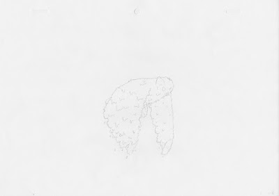
I wanted to experiment with pencil/natural style effects in photoshop I
tested a few new brushes I found online. The one I found for this I felt
was the best out of the ones I'd downloaded it created a nice effect. I started this onform by drawing out the shape in a sketch book so I could do some rough sketches of ideas. I settled on the one below quite quickly and moved onto making it.

I was very pleased with the final outcome of this entry, I wanted to use this task to experiment a bit and I feel I've tried some new texturing techniques. It was one of the first gifs submitted to onform and was quite popular on the blog.
Subscribe to:
Comments (Atom)