I have been looking into animation festivals in general to get an understanding of whats out there and how I should prepare
The festival I particularly wanted to send my film to is pictoplasm in Berlin as this is one that represents a lot of work from my favourite animators.
Fortunately one thing I noticed is that a lot of the festivals don't actually ask for premiere status which is great as I would like to publish my film in the near future.
What I noticed about most festival websites is they pretty much always have 16:9 screen shots or posters for films rather than the normal portrait paper dimensions.
I would also like to try submit my film not just to animation festivals but also web based sources such as short of the week, so I can make a push to get more publicity on my film.
Thursday, 11 May 2017
what I plan on redoing
After submission I plan to go back into the animation and reanimate or change the edit of some scenes to make the film the best it can be without the given time restrictions.
-the turning on the tap scene I want to further animate the hand with more articulate fingers and also increase the amount of time the tap vibrates to make a better gag.
-The first scene outside I want to properly animate the yellow character instead of blurring out as a lot of people have been unclear what is going on in this scene
-I plan to do the same in the next scene with the yellow character but also possibly add an extra gag where they turn and wave enticing the main character
-The close up of the face sizzling I want to animate sizzle lines and animate facial movements
-The big pan I need to fix the end loop on the legs
-after the character jumps and lands for the second time they have a reaction shot after seeing the yellow guy I want to animate them getting up and reacting more.
-I want to change the timings of the main character getting kicked in the face, falling to the floor and blacking out as the pacing is slightly off.
-I want to change the effects on top of the live action scene make it as god like but maybe a bit more clear.
-the entire last section needs either fully animating or further animation added to what is there.
Tuesday, 9 May 2017
Long shot performance
During this animation I was often careful with the use of long shots as I knew they can often be a lot more time consuming to animate because you have to animate the entire character because all of them is in shot. There were shots however that needed to be long shots to help tell the story. These shots in the end prooved to be some of the best shots in the film in my opinion. I felt these were the best shots because I managed to get across good performance in these shots compared to others.
Since the entire body is in the shot it gave me more to play with in getting the character across such as moving the legs at different paces to get across that the character is scared.
In this shot I really wanted to take advantage of it being a quite shot. I wanted time for the viewer to breath after an odd LAV section they would have just watched. Having it a long shot meant I could emphasise the character being a bit lost and use the whole body to get this confusion but nonchalance across.
Monday, 8 May 2017
Creating worded ephemera
For study task 5 I had to create some worded ephemera to go a long side my film for press reasons. I feel I often struggle with these things as I have a habit of underselling my own work and also keep my bios/synopsis ect very brief as i like cutting to the point however for this kind of things embellishment is important to sell a film to get people to actually watch it.
My Synopsis of the film:
Thirsty is a colourful and silly 2D animated short film which plays homage to classic cartoons like spongebob squarepants whilst gaining stylistic influence from a range of illustrators and designers. Thirsty is about a messy degenerate who has marooned himself in a desert shack and finds himself extremely thirsty after a mischievous yellow creature steals his one source of water, forcing him to chase them across a weird land in pursuit of a quenching relief.
My personal Bio:

My Synopsis of the film:
A messy degenerate who has marooned himself in a desert shack finds
himself thirsty after a mischievous yellow creature steals his one source of
water forcing him to chase it across a weird land in pursuit of a quenching relief.
This is a slightly embellished version of the synopsis and is purely about the plot another version describes the plot but also the film itself:
Thirsty is a colourful and silly 2D animated short film which plays homage to classic cartoons like spongebob squarepants whilst gaining stylistic influence from a range of illustrators and designers. Thirsty is about a messy degenerate who has marooned himself in a desert shack and finds himself extremely thirsty after a mischievous yellow creature steals his one source of water, forcing him to chase them across a weird land in pursuit of a quenching relief.
Oscar Barany is an animator and visual artist from London graduating from BA(Hons) Animation at leeds college of art. He makes Animations, Live visuals for Musicians and Interactive art. He predominantly uses characterful 2D animations across platforms and enjoys pushing the boundaries of where his animated characters can go. Over the last two years he has working with a wide range of clients from Musicians to Museums across the UK as well as developing his own independent practice. See other work at http://ozbox.tv

go over my footage after the final crit
It was good to once again see my footage on a projector rather than on a screen I got to see how the footage looked in its proper context as well as allowing me to step away from it. Although there was not much feedback during the crit the fact I was forced to render it off meant I could keep watching my footage without it being in premiere which can be distracting.
Somethings I noticed as well as other pointed out to me were:
The edit of the animation sometimes did not quite flow. This mostly happened in the first section were there are a lot of cutes between the two characters predominantly for action and reaction. It was mentioned which I agree with that the cuts a bit laboured and each scene holds a little too long. I think this was in reaction to what I was doing at the start of this project which was cutting from some shots too quickly. I’ve realised I have a habit of just applying the same solution to everything rather than objectively
I need to go back an reanimate sections. Although I was happy with the delivery of gags and most of the scene some were animated in a ways to save a bit of time to get the film ready for submission or things I missed out to do in scenes have been added yet. It is unlikely I will be able to do this for submission but I want this film to be the best it possibly can. I obviously want to keep to some deadline I can't keep editing the film forever but I do want to clean things up if they are letting the overall quality of the animation drop. I also want to take this opportunity when I do go back into scenes is to reinforce or create new gags if I can. For instance one suggested to me was to have the yellow character wave back when running across the desert which I'd planned to reanimate since it had been done quickly in after effects.
The sound design as Ive said before needs revisiting but the interim sound design is still too quite.
Other than this I am so far very happy with my film.
creting an an art book
Here is an issue of my art book. I have edited edited the book a little since and want to add more to the final version. It was good to learn a new skill, I'd not used Indesign before, its a useful skill to posses. I definitely need to revisit the design of the book but it outlines the preproduction of my film quite well.
creating a trailer
Creating a trailer for Thirsty was a very enjoyable process and was something completely new for me as I'd never made a trailer before. I wanted a trailer that really pumped people up to watch the film and to carry through the silly irreverent vibe of the film. I thought about going the route of most trailers which somewhat outline the plot of a film but the plot for my film is very minimal and to me thats not the selling point of the film. Something that I had been focussing on was creating lots of silly and differentiating faces of the main character across the film. I figured this would be a great thing to show off to the audience.
When thinking about how to show off the faces of the film I went back to the point of wanting to pump up audiences to make them excited to see the film so I decided to go for a classic thriller style cut which I thought would add comedic value to the trailer. Although normally trailers seem to stick to their own genre so the audience know what they are watching straight away the exaggerated cartoon style of my film is so polar to a thriller that I figured it would work and be pretty funny at the same time.
So far reactions to the trailer have been great the mash up of comedy juxtaposed with a thriller cut seem to make people laugh a lot whilst also pumping them up to watch my film.
Here is an extra silly cut of a trailer mostly for personal use rather than release. (The ultimate film trailer!!!!!!!!!!!!!!!!!!!!!!!!!!!!!!!)
Sunday, 7 May 2017
Creating a final poster
Creating a poster for my film was a really enjoyable task and thanks to creating an art book was a fairly straight forward process. I looked at a lot of posters for Animated shorts, Animated features and feature films to help inform what I made. What I found which is fairly obvious is that they were all incredibly different and there did not seem to be a set of rules on how to lay out a poster. Obviously the title need to be a big focus of the poster but it also needs to advertise the film. Like the trailer it needed to capture the essence of the film to help sell it. I reused the cover image for my art book which was a silly illustration for the two main characters. I then retextured it to give it more depth and to darken it a bit so the text would stand out more. I used the title from the film to keep continuity in the design plus I felt the hand rendered drip text fit well. I redrew the text in a much larger size so it still looked nice and crisp.
I might need to add more to the poster and I might also update the strap line at the top after I get a bit more feedback on the poster however I am currently very happy with it.
Early design:


Here is the final poster design for my film:

I also created an alternate 16:9 card for the film using a background design and the same text. I did this as I noticed a lot of websites like to display this format rather that the traditional paper size poster for print. I may need to add more text/info to this poster.

Seeing footage on the big screen
We all submitted our films in progress to have them projected in the lecture hall. This was a great opportunity to see how my film looked on the big screen. Other that a few informal crits in the studio I hadn’t really taken the time to watch my progress in this context. It was great to see my film on a proper screen and since it was projected so big you couldn’t hide any mistakes. One big thing I leant were my audio levels on my sound design were completely wrong everything was far too quite so I'll need to revisit my levels. A talk from Steve reinforced how important sound is for film and said often a down fall of a student film is the sound.
After this crit I asked Steve for further feedback as he curates manchester animation festival his insight is one of the best since I want to submit my film to festivals. The feedback was very positive which was great other than removing a gag involving the animators survival kit which I have amended and to sort out the foley.
This crit also did reinforce how much more I needed to do on the film for the final submission but I will just pick up the pace on it.
struggling with sound
Typically like I have done with every animation I left sound a bit too late and did not give it nearly as much thought as I should have. Although I had planned plenty of time to do sound the project fell a little behind schedule so when push comes to shove its the sound that got left by the wayside.
During this project I really discovered that sound is really quite a weakness for me. I take a very long time to do sound and I really don't understand how to use it well. The main weakness for me is understanding a stylistic approach to sound design. Gauging how "wacky" to make sound for a cartoon compared to how realistic to make sound design is something I find difficult. This is definitely something I want to improve as sound design is always a really important part of a project.
Although I want to improve my skills in sound design I want to take this film to festivals and generally would like to see it do well. For that reason I want to get someone else to create the final sound design for the film. I will continue to work on creating sound in the interim but I will continue to search for someone to create sound for this film at a later date.
Thursday, 4 May 2017
changing running sequence for a better edit
This animation has really taught me a lot about the power and importance of editing. One scene that seemed to work in the animatic did not translate at all into the final animation. The scene is the main character running towards the yellow character (They really need names) and after the shot of the main character running the camera zoomed in on the yellow character. When put into practice this looked rubbish. I decided to change the scenes edit but wanted to keep the overall scene so I went for cutting between the two characters zooming in with each cut to build up tension to the final gag of the scene where the main character gets kicked in the face. This worked so much better and I think I would have figured this out much sooner if I had done a better animatic with more movement in it.
New edited scene
live action sequence
Part of my film is a hybrid of live action and animation. Fortunately I've used this process a few times so I knew what would work in this scenario in terms of compositing. I decided to make life much easier to make sure all the shots of the main character were either mid shots or over the shoulder so I wouldn't need to ground them.
When it came to filming I wanted it all to be as easy as possible and then sort out everything else in post so I could get nice clean recordings and focus on directing. These scene involves two guys on a sofa outside who are made to seem like godly figures. From past projects I new the after effects plugin trapcode: Lux would be great to get this effect and also playing with the colours of the scene I could create a somewhat dreamlike feel to the scene.
Filming on the day was met with a few challenges most of which were to do with the location. I was filming outside so the hardest thing was recording the sound. I was using an external sound recorder but it was a particularly windy day and hyde park is a particularly noisy part of Leeds. FortunatelyOllie came up with a good solution for the wind by suggesting I use some kind of barrier to protect me so I lined up all the wheely bins by the location to create a barrier which allowed me to get nice clean audio.
I was happy with the final recordings and got a lot of similar takes to make sure. Some feedback said I should dial back the shine in the final version and use some other techniques to create an angelic appearance so the footage is a bit more clear. I plan to do this but still want to keep it very dream like/ridiculous.

Camera test checking good angles from the shot

Style frame


Wheel-y hard work
exaggeration in animation
This animation was really to try and help me push my animation skills so I wanted to utilise the fact I was creating a predominantly frame by frame animation. This animation was also relying heavily on visual gags so it was important that the animation helped carry them. This was an opportunity to really push exaggerated movements through my animation that I hadn't really done previously.
Something I had not really done before in animation was the use of stretch frames. They're really good to exaggerate a movement especially in this "cartoony" way. I read the section in the animators survival kit and tried to take not of the use of stretch frames in other animations. One that particularly inspired me was a quick animation test from an animator at Animade. (https://www.instagram.com/p/BSwCXH0Bx6g/?taken-by=animadetv&hl=en)
Another thing was being conscious of animating motion blur to help exaggerate a movement. Normally it's just something I try to add in post but I wanted to be fully in control of how the motion blur looks and its timed as you can get a more appropriate look doing it properly with cel.
Overall I've tried to exaggerate movements where appropriate to really try and flex some animation skills.
Here are two shots were I tried to push a bit of extra exaggeration in my animation featuring stretch frame, blur and stretchy limbs.
slap timing
I recently animated a scene where the main character is slapped by a floating hand. I thought this would be a very straight forward thing to animate but I was something did not look right with all my attempts as the timing was all wrong. I could not figure out what was wrong so I asked a tutor. I was told about a rule of hits in animation about not actually showing the hit. The problem with the way I was animating the scene is the hit looked too laboured because there was too much emphasis on the connection between hand and face. I completely redid the whole scene changing the timings so there isn't actually a frame that lands on the slap.
This is a really useful tip to remember which I can carry through to other scenes that contain impacts in this animation.
This is a really useful tip to remember which I can carry through to other scenes that contain impacts in this animation.
Thursday, 27 April 2017
referencing the use of sound
After trying to do some of the sound design for my film I realised it was a much bigger job than I first thought and one that I am not as good at as I thought.
I spent a few days compiling and editing sounds for this animation however I have come to realise I need to make more of my own sound effects. At the moment I have interim ones I have sourced online from sound libraries but I want to record lots of my own foley so I can get the exact sounds that I need for the animation. I also created interim sound for the characters in my animation but I need to cast some people to play the characters so each character has their own distinct voice (even though they don't speak)
I want to get better at sound design which means I need to study it more. I've come to realise for this project that sound design like animation is very stylistic and requires very appropriate selection to create a style of SFX. Its very important that the sound effects match the animation. This is something I've been struggling with balancing real noises with distinctly cartoon ones. I've been taking note on watching whilst watching a some cartoons on how they do they sound design but they are all very different.
I think for the very final edits of the film especially when thinking about sending it to festivals I will seek collaboration for the sound design because it is something I'm not the best at and slow at doing. I understand the importance of sound and do not want bad foley to drag my film down.
Production update
I have been carrying on production which seems to be slowly speeding up as I get better at animating each character.
We have frequently been having informal crits which have been very useful. Something Which I've been told to do is to sort out sound design, which my film is definitely lacking.
Something else that has been brought to my attention is that some of the scenes don't go on long enough to reinforce visual gags. Scenes such as the tap dribbling need to go on a bit longer so the audience can take in the scene laugh at the gag then move on to the next thing without being too rushed. This is something I will bare in mind for future scenes I animate.
here is some of the progress I've made so far:
Monday, 24 April 2017
sound scripting
I should have sorted out sound design at an earlier stage in the film but as always I ended up putting it off. I do want to sort out sound design as soon as possible so when I show people my film in progress it makes a lot more sense.
I started to script all the sound design that would I thought the film needed. I played through my footage and animatic scene by scene, writing down every sound effect that was needed. This included ambient/background noise, character sound fx, character "speech" and all other sound effects.
Now that I have this written I can start straight away on sourcing and creating sound.
Saturday, 15 April 2017
Shot schedule
now that I was starting production I needed to make sure I stayed on top of my work load. Although gant charts are effective I often prefer using lists and creating monthly and weekly lists to stick to. I decided to make a list of all the shots I needed to complete in the film and if they were particulalry long of difficult breakdown that shot further.
Once I'd done this I had a very nice breakdown of my work, I started to take parts of this list and put them on a weekly completion list. This was a nice way to do it for me as I could work out after I'd started a bit of production how long I needed after a bit of experience. It also helped me balance the workload nicely with other things (Client work, PPP, ect)
Once I'd done this I had a very nice breakdown of my work, I started to take parts of this list and put them on a weekly completion list. This was a nice way to do it for me as I could work out after I'd started a bit of production how long I needed after a bit of experience. It also helped me balance the workload nicely with other things (Client work, PPP, ect)
Thursday, 13 April 2017
going through background list
Before I started actually animating I wanted to complete all the backgrounds first. I decided this after we had a talk from Frasier Mclean who told us about the importance of layout. I figured since I was doing most of the layout during the creation of backgrounds it made sense to finish all the background work before production began. This meant I could animate straight onto finished backgrounds and I wouldn't run into any errors of things not matching up at a later stage in the production.
I made a list of every different shot that required a background and slowly went through the list creating all the backgrounds. I made sure each one was equipped with whatever specific lighting or moveable layers were needed for the scene to work so production would be as easy as possible.
I made a list of every different shot that required a background and slowly went through the list creating all the backgrounds. I made sure each one was equipped with whatever specific lighting or moveable layers were needed for the scene to work so production would be as easy as possible.
timing errors
Something I quickly encountered in production were timing errors in my animatic. Although I felt the pacing of the animatic worked well often I needed longer for the movements of the shot and sometimes shots needed a bit more room to breath. Fortunately this hasn't added any extra time to production and a lot of it is resolved through holding frames. In future (although I tried to do so in this animatic) I need to put more movements into the storyboard to better time my shots.
title design
Title design is something I had not given a huge amount of consideration. One of the first shots in this animation is the title card and I didn't want to leave this till the end as I figured the production would benefit from having a title ready.
I wanted something that matched the tone of the film and the setting of that scene. Since the film is called thirsty and is a bit gross in general I wanted the text to reflect that. Since I'd had a lot of inspiration from classic 90's skate art e.g
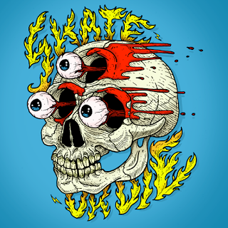
So I wanted something that played off that.
I went for a drippy design to look somewhat like sweat which I then animate dripping in and fading out.
I am happy with the overall final look but I may need to tweak the text for posters and such.
starting production
I had now finished a large majority of the preproduction work so it was now to time to get start production on the animation. Since I was not using animate I decided to use photoshop for animating as I already had a good workflow in this software.
At this point in the production (just starting) I really want to keep corner cutting down, I am all for saving time but I want the animation to look the best that it can. I would rather it run over schedule but look its best. I really want to use this opportunity to improve my traditional animating skills so I will be keeping the use of after effects to a minimum.
At this point in the production (just starting) I really want to keep corner cutting down, I am all for saving time but I want the animation to look the best that it can. I would rather it run over schedule but look its best. I really want to use this opportunity to improve my traditional animating skills so I will be keeping the use of after effects to a minimum.
Monday, 3 April 2017
trying animate cc
Since I wanted to animate this animation frame by frame I figured it might be worth altering my working pipeline. I remembered seeing a previous student using Animate cc (flash) to create their rough animation and then colouring their animation in photoshop. I thought this would work well for me as I prefer the look of colouring in photoshop compared to flash I thought the aesthetic would work better for this animation.
I got one of my starting scenes and decided to try and use flash to animate in. After asking a student who had started using animate I was given a good video tutorial that showed you how to use animate cc. The video was create by a youtuber/animator draw with jazza. The video went through all the basics of the software features and then went on to actually animating. Once I had learnt the basics of animate I started trying to animate with it. Although I thought the timeline in animate was brilliant I could not get passed the vectorised drawing in it. Although with more time this could have been a good option I had already given a lot of time to this and did not want to takeaway any more time away from animating. Therefore I decided to go back to using photoshop as my workflow was at a good pace using this.
I got one of my starting scenes and decided to try and use flash to animate in. After asking a student who had started using animate I was given a good video tutorial that showed you how to use animate cc. The video was create by a youtuber/animator draw with jazza. The video went through all the basics of the software features and then went on to actually animating. Once I had learnt the basics of animate I started trying to animate with it. Although I thought the timeline in animate was brilliant I could not get passed the vectorised drawing in it. Although with more time this could have been a good option I had already given a lot of time to this and did not want to takeaway any more time away from animating. Therefore I decided to go back to using photoshop as my workflow was at a good pace using this.
twaeking animatic feedback
We had our first crit since creating our art books so this was a good opportunity to get some feedback. Everyone watched through my animatic and the response was very positive, my main fear was that the humour would not translate but the animatic was met with some laughter and that should improve when animation/sound is added. The main feedback was:
Consider sound really carefully and cast the two characters separately so each one was "voiced" by different people.
Slow down some of the camera movements I had put in the animation and think about adding easing to them.
Other than those feedback was crack on with animating.
Consider sound really carefully and cast the two characters separately so each one was "voiced" by different people.
Slow down some of the camera movements I had put in the animation and think about adding easing to them.
Other than those feedback was crack on with animating.
creating a big tilt shot
one of the hardest shots in my film is one that involves a camera tilt (moving on its axis) whilst the camera was also panning (moving laterally). This shot is supposed to show what the main character sees in the cave and reinforce that it is him who is seeing all the weird creatures. I started by looking at Fraser Mcleans book about layout design, although it was helpful it did not fully resolve my issues with the final shot.
This is a breakdown of creating the shot
I attempted to create the shot experimenting with line work in photoshop and then moving it in aftereffects but all my attempts did not look right.
After speaking with a tutor the best cause of action was to test with live action filming to see how I could create this shot. After a few ideas I settled on a test that worked well, I draw a rough cave on a very long piece of card, which I shaped into the shape of a cave. I then moved a camera in the space how I want it to move in the animation. It was at this point that I realised how the layout of the shot would work.


paper test
Once I understood how the shot would move I started to do further tests. I drew the layout to the correct size and tested it in after effects. This confirmed that the layout worked and I could create the final background in the layout.
Once I had finished the entire background I went to animate all the characters that would fit into the space. I used past designs from this project as reference. There were all animated to loop so I can run them for as long as needed meaning I could work out the timings of the shot at a later date.
The problem with working with this shot was that it was very large which meant it ran very slowly in aftereffects. This was significantly slowing my workflow so I needed to solve this. I decided to pre-render all the separate animations in the sequence then put them back in, this sped everything up a lot.
further background work
Once I had established the overall look of the backgrounds (colour palette, line thickness, texturing) to all fit together I created a list of all the background that would be needed for the whole animation.
I started with one background from each main location (e.g desert, cave, house) so I could define the palette of these locations as well as make sure they all work in succession. It was important to me that the backgrounds didn't just look nice but really help to tell the story. For the house it was really important that it really helped layout who the main character was (messy, crusty, lazy) and the other parts of the story were reinforced particularly the mood. I did this through colour and added details
I really enjoyed working on the backgrounds for this animation here are a few examples:

The inside of the house are the only backgrounds that have texture to make it look really gross and messy.

It was important that the backgrounds it the desert were really bright to contrast the house. It was a challenge to make these backgrounds simple but also keep them interesting.

The cave backgorunds are all fairly dark, always with directional lighting to reinforce that all the light comes from the middle were all the creatures lurk. I wanted the cave to feel a little creepy and uncomfortable as well since the character doesn't like being there so the colours I chose should reflect that.

Thursday, 9 February 2017
backgrounds
Background design is something I really enjoy and think its really important. I want the background to be a really integral part of the animations design. Although I had set out with mood-boards for the backgrounds I felt the I have deviated quite a bit from that. Al the things I had mood-boarded was quite flat and I wanted to move away from that in my animation.
Colour palettes were something I really found difficult for this I tried a few different colour variations for my first main background but they all didn't look quite right. I realised I needed to simplify what I was doing and use a more limited palette
Colour palettes were something I really found difficult for this I tried a few different colour variations for my first main background but they all didn't look quite right. I realised I needed to simplify what I was doing and use a more limited palette
storyboarding
Storyboarding is arguably one of the most important stages in production and something I can often find it quite intimidating. This time however I really enjoyed the whole process and I am glad invested quite a bit of time into it. I started on post it notes and slowly went through my treatment panneling every shot. I thought carefully about trying to reuse shots if I could to save time when it came to production but made sure that didn't come at the expense of the story. For this project I really tried to push some more 3 dimensional camera shots and use a variety of camera angles. I have a habit of producing very flat work from not many angles so this was a good opportunity to break out of that. I felt that this lot of storyboards did that successfully.
A lot of shots got cut and altered to create the final rough version of the storyboards. Once I was happy with the first rough edit I cut the storyboards into a quick animatic to see how they run and whether more or less shots were needed before I redid them in neat.
I was fairly happy with the edit there were a couple of amendments and additions but after that I could move on to mocking up the boards in neat. The final boards where all pretty much the same other than some slight shot adjustments. I think I need to add some more lighting to some of the shots. I did not add that much layout to a lot of the shots as this is something I am planning on establishing further with environment design.
link to my final storyboards on boords: https://app.boords.com/s/5e3d4k
A lot of shots got cut and altered to create the final rough version of the storyboards. Once I was happy with the first rough edit I cut the storyboards into a quick animatic to see how they run and whether more or less shots were needed before I redid them in neat.
link to my final storyboards on boords: https://app.boords.com/s/5e3d4k
fraser mclean
Fraser Mclean was a really interesting speaker and probably one of the most insightful we've had at the college. He came for a talk at a really opportune time in my project as layout was something I had not really thought about much but its a really important thing to apply to my animation.
Since I've been trying different shots for this animation there were some layout problems I wouldn't have thought needed solving. After Fraser talk on the importance of it I went to read his book "setting the scene" which was really useful. It was really important especially for one scene that has a camera rotation so the background needs to curve to keep the perspective right. I need to do further reading of this book.
Since I've been trying different shots for this animation there were some layout problems I wouldn't have thought needed solving. After Fraser talk on the importance of it I went to read his book "setting the scene" which was really useful. It was really important especially for one scene that has a camera rotation so the background needs to curve to keep the perspective right. I need to do further reading of this book.
Director reviews on youtube
A really good way to understand film theory is from the many youtube based film analysists. There are a lot of channels that talk about film theory however two I have found particularly good have been everyframe a painting and Nerdwriter1. Both the people often analyse directors as well as films and provide useful insight into film traits I'm using for this project.
One from every frame apianting that is really useful is the one on busta keaton one of the original silent comediens of the time. One thing I took not of in particular is the way busta keaton frames his gags and a lot of them make use of the camera. He uses the rule of "If its not on frame then it doesn't exist" which means ridiculous things can come out of no were because the camera was not looking at them.
Another really useful analysis was slightly more relevant to animation which was an analysis of Ren and Stimpy. Although I am not a huge fan of the show for its overtly disturbing themes it does have some brilliant moments. A big thing I took away from it is the success of its originality. Every frame is different there are no quick fixes in ren and stimpy. Every facial expression is different so when you're watching similar weird gags they never get stale.
One from every frame apianting that is really useful is the one on busta keaton one of the original silent comediens of the time. One thing I took not of in particular is the way busta keaton frames his gags and a lot of them make use of the camera. He uses the rule of "If its not on frame then it doesn't exist" which means ridiculous things can come out of no were because the camera was not looking at them.
The spongebob Movie
Over the christmas holidays I re-watched the spongebob movie which I had not watched in a long time. I forgot at the sheer brilliance of the visual comedy created in this film. It was really inspiring to watch and showed how even with childish humour the right timing/framing can create an impressive gag that everyone will find funny.
Something I really wanted to pay homage to was the ridiculous faces of spongebob. It is a constant source of amusement in the film and show. This is definitely something I can utilise and fits into the silly characters I often draw. The use of framing in the animation really pushes the comedy of these faces and makes sure its ridiculous pose it not lost on the audience.
One of the best sections of the film.
Something I really wanted to pay homage to was the ridiculous faces of spongebob. It is a constant source of amusement in the film and show. This is definitely something I can utilise and fits into the silly characters I often draw. The use of framing in the animation really pushes the comedy of these faces and makes sure its ridiculous pose it not lost on the audience.
story refinement
After the pitch I started to refine the story of my animation. The Main thing I was focusing on was adding ore conflict. The story was about a really thirsty character trying to get a drink so I thought it would be best for another character that was the polar opposite from the main character in personality to steal some water to force a chase which would form the A to B narrative.
Once I got a rough idea of what character I was adding to create conflict I started doing flow charts of the story. I was plotting key events I wanted to take place it the narrative and slowly added bits. I kept going through this process until I had a full linear narrative.
Once I had finished this I went to see Max one of my peers who I felt it good at writing narratives and comedy. We went through the story together to add or remove gags think about timing and also come up with the final resolution gag. This was a really beneficial process as even just saying ideas alud helped them to flourish.
Reading Graphic Novels
I really enjoy reading graphic novels especially one offs with different styles. I found these to be a really good inspiration for this project. Over the last few years I've slowly built a collection of graphic novels at events like thought bubble. This has been an excellent resource for this project. One of my favourites for this project was Matt Forsyths Ojinchallo which is a graphic novel without any words. It doesn't have the luxury of movement so it conveys the entire story through single imagery which I found really interesting and is something I need to apply to my own film.
The art of ooo
The art of ooo is the adventure time art book. It breaks down all the design choices shows sections of the shows design bible and takes you through the thought processes behind a lot of the show. Its a really interesting read as the book shows the do and don'ts of how to draw and animate characters. The bible shows that the characters can be altered in many different ways like finn can have between 3-5 fingers depending on the shot but it always works. I want to set specific parameters like this for my project.
Post pitch
Pitching was a really useful stage of this project it forced me to settle on ideas and really start setting the project on motion but it also provided me with some essential feedback.
The concept of my film seemed to go down well people responded well to the idea, style and mood I was trying to pitch however it was apparent that my story needed quite a rework to make it a better comedy.
My story at the time lacked any conflict so nothing was really driving the animation forward. At first this didn't seem very apparent to me but when thinking about the animation running as a whole it made sense that my current story would not work very well.
I decided to keep the current narrative the same as I liked the concept and I didn't want to waste time on concepting something completely new but rework it so it flowed better.
further story development
Once I started to come up with settings I wanted to include in my world 9a desert, a cave and a jungle) I quickly started to come up with ideas for the project. The problem was I quickly incoiuntered a common pitfall which I often do when planning animatins. Once I have one idea I like I stick to that and don't move on from that.
I did that with this project and for at least a week I was dead set on doing one idea that wasn't all that good. Once I realised what I was doing I quickly tried to plan completey different stories in the same settings to distance my self from the original idea. At a later date I could take gags and ideas from it if it would help the story.
After going throught this process I wound up with a simple narrative which I thought could be effective for this project.
story generation
I knew I wanted to create a simple narrative so I started the slow process of idea generation. I personally feel that one of my most successful animations that I have made during my degree has been one of the first ones I have made. It was technically the best but its simple narrative was easy to follow and I thought it was pretty funny, this was my golgothan animation.
The reason I felt this story was successful is that it focused on one main character travelling from A to B for a simple reason. The character's journey is interrupted for the sake of humour. This is a really effective and simple way to create a comedic narrative.
I started off struggling with a creating a concept and spent a lot of time coming up with nothing. I reliased I was trying to pull a story out of thin air which was not going to happen.
I decided a better way to create a narrative was to build a world first then fit characters and stories into it. This is somewhat how show like adventure time structure their episodes and its a solid formula.
creating mood boards
Pinterest has been an excellent resource for this project, as it is so easy to create an online moodboard and if images are not available on pinterest you can just upload them yourself.
Here is a link to my pinterest page for extended practice
https://uk.pinterest.com/oscarbarany/extended-practice-inspiration/
I have been really interested in the print aesthetic for this project and seeing what interesting textures I can get with my work. I also have been interested in using characters with no outlines. It is a style of character I started to experiment last year and want to build on it. I also think it can be easier to animate characters like this frame by frame as line boil is less apparent.

Character board

Enviro board
Maf inspiration
Not long into the initial planning phase I went to manchester animation festival. What I always feel is the most useful thing at the animation festival is watching the large numbers of shorts available. In a discussion before with a few people it was apparent there was not enough comedic animation getting recognised by festivals so this was something I wanted to aspire to. The comedic animations were also ones people could unanimously agree on enjoying.
The main thing I learnt from the best comedic shorts at MAF was the importance and possible utilisation of visual comedy in animation. Most of my favourite animations had no dialog, all the jokes were told through character action, juxtaposition and timing. This is something I really want to apply to my animation and really build on my film making skills.
The main thing I learnt from the best comedic shorts at MAF was the importance and possible utilisation of visual comedy in animation. Most of my favourite animations had no dialog, all the jokes were told through character action, juxtaposition and timing. This is something I really want to apply to my animation and really build on my film making skills.
starting ideas
I knew from the start I wanted to make a short film for this project. I feel my film skills need to be challenged more as I've often shied away from creating a full length animated short with a proper narrative behind it.
I was torn between making something with a serious message and making something silly. After a few discussions I realised I wanted to go back to the roots of my animation and go with something funny. I felt I would enjoy making this more as I always like making ridiculous irreverent designs and little animations so this would be an excuse to scale that up into a bigger project. I also wanted to take the opportunity to improve my comedy writing/directing skills especially visual comedy.
My writing skills aren't a strong suit for me so I knew I should keep the story for the animation simple. I want to make something that I would personally find funny and hope that my similar demographic would also enjoy it. So my target for this animation would be young adults who still watch cartoons.
My writing skills aren't a strong suit for me so I knew I should keep the story for the animation simple. I want to make something that I would personally find funny and hope that my similar demographic would also enjoy it. So my target for this animation would be young adults who still watch cartoons.
Saturday, 7 May 2016
Finished film
Once all the titling was complete and I had the sign off on all the footage/sound the film was ready. I was really happy with the final product although of course a few things could have been done differently it turned out great and I had a very good team. Communication throughout the project was very good which I think helped the success of the us as a group and the project as well.
Titling and idents
It's important for the professional look of the film to have good titles and idents. For the titles I used a nice "hand drawn" type and then to give it a bit more life I gave it a little wiggle in after effects. I used a displacement map on the text hooked up to a fractal noise layer to make the text move slightly. This made sure the text fit in with the rest of the hand drawn aesthetic of the animation. I did idiotically spell Lauren's name wrong but fortunately since I kept sending the work back and forth it was quickly corrected.
For the college logo I thought it was a bit plain to just have the black and white logo in the animation. I downloaded a copy which had a transparency layer which was very useful as it meant I could use a trk mt with it. I composited one of the water colour backgrounds in with it to make it fit more with the overall composition. For the opening logo I wanted it to be a little more animated so I took a series of water colour splatter brushes in photoshop and layered them up with a track mat to have a similar effect. It gave a nice playful look to the whole thing and felt it made the piece look more professional.
As a group collective we needed to represent our selves at the start of the animation like most production companies do. We had labeled ourselves team OWL so we went with that. I had an idea that we could produce an ident were we all pitch into the animation and create something like this: but using an owl flying sequence instead. Wing created the outline frames for the owl flying then we each did three frames in the cycle which was then put together with some hand drawn type. Here are my 3 drawings for it:


For the college logo I thought it was a bit plain to just have the black and white logo in the animation. I downloaded a copy which had a transparency layer which was very useful as it meant I could use a trk mt with it. I composited one of the water colour backgrounds in with it to make it fit more with the overall composition. For the opening logo I wanted it to be a little more animated so I took a series of water colour splatter brushes in photoshop and layered them up with a track mat to have a similar effect. It gave a nice playful look to the whole thing and felt it made the piece look more professional.
As a group collective we needed to represent our selves at the start of the animation like most production companies do. We had labeled ourselves team OWL so we went with that. I had an idea that we could produce an ident were we all pitch into the animation and create something like this:
 but using an owl flying sequence instead. Wing created the outline frames for the owl flying then we each did three frames in the cycle which was then put together with some hand drawn type. Here are my 3 drawings for it:


Getting sign offs
Once I'd done the "final" edits I kept sending the changes through to the group asking for feedback n it. Any changes to sound and the video were open so I could fix any problems I missed. I wanted the animation to be nicely polished and am aware that I could easily miss things or think some sounds may work better than they actually do.
This proved really effective especially when I stressed that I wanted criticism on it I got good feedback to help me improve the edit further. This is definitely something that should be done with all group work.
This proved really effective especially when I stressed that I wanted criticism on it I got good feedback to help me improve the edit further. This is definitely something that should be done with all group work.
The premiere edit (sound)
Once all the sound a compositing was completed I could move on to the final edit. I was unsure how many sound effects were needed but I didn't think it would be many. The first edit was just with the narration and the animation seemed to lack a lot of impact, it was definitely missing something. I added a series of sound effects for things that were going on in the animation but the sound still seemed vary sparse and there were quite a few silent sections that were very jarring. I thought it would be a good idea to put sound to the animated pencil lines and colouring as this made up a lot of the quite sections in the animations. I couldn't ind any goo pencil sounds online so I recorded a range of pencil sound fx myself. This worked out really well and I think it definitely gave the piece what it was missing.
Voice recording MK2
We had a set of voice recording from our group made so we could establish the animatic timings but they were not as good as they could be and the narration was an integral part of our animation. We should have done this before we started production but we didn't manage to before easter by which time we had to start production as it was three valuable working weeks. For future project I will make sure final voice recordings are a number one priority.
We got a variety of people to voice act for us and got them to do multiple scenes from our animation we tried to get as many as possible to do it so we had a good range to choose from. We showed them the animatic before hand with the original recordings to try and replicate similar timings. I was happy with the results we got from the session and they were much better than the ones used in the animatic.
We got a variety of people to voice act for us and got them to do multiple scenes from our animation we tried to get as many as possible to do it so we had a good range to choose from. We showed them the animatic before hand with the original recordings to try and replicate similar timings. I was happy with the results we got from the session and they were much better than the ones used in the animatic.
Putting all the edited footage together
I wanted to export each story separately from after effects but in no smaller pieces as I felt it would cause problems in premiere. I was also rendering the videos out as lossless files so I didn't want lots of massive clips. To make sure everything was edited correctly I put the animatic into the final comps of the 3 stories to make sure the timings were the same. In some places I increased lengths of video when I felt it was needed. A lot of the clips required holds to make sure they were the correct lengths so I just grabbed the final frames and put them at the end on the image sequences. This was a lengthy process because I had to go through many pre compositions but the flow chart in AE really helped. This method was nice an easy when it came to editing because there were only 3 videos I needed to re-render if changes where made so there was little room for confusion.
Colouring the animation
Colouring the animation was a fairly straight forward task since the technique was already established in the pre production phase. Each scene with colour needed to be filled in frame by frame to then be composited in after effects using track mats. This was fairly easy to do just a little time consuming.
A problem I noticed when I composited the first colour was that I hadn't used proper water colour paper. The texture of the colouring and paper was not very nice and stuck out from the main background. I went a brought some actual nice water colour paper and the results were much better.
Another problem I encountered was having two separate colours with this technique. I was unsure how this would work as I couldn't try to have two colours in the track mat background as the animation moves over the still. I figured out I would have to colour the separate parts of the animation twice if I wanted two colours. This would allow me to set up two separate tracks mats afterwards.
We wanted the colour to feel realistic (like it was actual water colour) so I used the custom brush I developed previously during the experimenting phase of the project. I used this when the colour was brought into a scene to make it seem more natural. Using the angle jitter settings I made sure each brush stroke looked different. To keep the colour in the lines I tested between just rubbing out overlap and trying to colour using the selection tool. The problem with the selection tool is it often left very hard edges which looked very out of place.
File organisation
Although this seems like a boring and straight forward task when doing post production on a project like this its vital that files are organised properly especially in the after effects project file.
Since I ended up having over 300 differently files including frames and colouring to work from it was really important I knew where everything was. I used lots of folders in the project panel to organise everything and also made sure all folders things were rendered too were labeled.
 A really useful tool I like to use a lot to make sure everything was in the correct place is the after effect flow chart. This function allows to see which compositions are in which and what things precompose into.
Since I ended up having over 300 differently files including frames and colouring to work from it was really important I knew where everything was. I used lots of folders in the project panel to organise everything and also made sure all folders things were rendered too were labeled.

Masking problems
Masking is an important part of the post production it allows backgrounds and overlapping animation to blocked out, they generally make the animation look more polished overall. The problem with the channel effects is they prohibit masking as they are already turning things to transparency. To get round this I needed to precomp all layers that required masking and make sure the effects where inside the precomp so they don't effect the mask. I'm glad this was a relatively quick fix.
animating in post
Some scenes seemed like they would be a waste of time to animate on paper as it wouldn't look any better. I laid out all the possible things that I could animate in after effects rather than on paper and then Lauren and Wing could decide which scene where not worth doing by hand. Scene like the cracking scene:
where animated using the stroke effect, its fairly simple to use just requires some attention from the pen tool to create a lot of masks. Wing draw the original cracks a few times so it looked more like it had been all animated by hand. I think the effect worked really well and definitely saved some valuable production time.
The stroke effect was also use to transition some backgrounds, as sometimes it was a little jarring when the scenes just completely changed to a solid background I use stroke to help them transition in.
Another section that was done in after effects was the bus driving away, it would be an overly lengthy way to do it by hand so I was just able to control its position and scale in AE.
Starting production
Wing and Lauren took the bulk of the production as they were more confident with traditional animation and I was going to do all the post production. I did however want to do some production as I wanted to practice my animation skills.
I animated 3 storyboard panels from scratch on paper. I found some of it to be quite challenging I had not done any paper animating in a long time and struggled with out being able to preview my work like you can digitally animating. Although I realised paper animation was not for me I felt like its a good challenge as an animator and I should try more in future as it really improves both drawing and animation skills.
I found staying on model quite difficult. I realised however that keeping the original designs in front of me helped a lot so little details wouldn't go missing.
It was nice working on a project like this as there are often things I would normally try and avoid as an animator but this pushed me out of my comfort zone especially the scene where the bear climbs over the fence as the angle on the bear keeps changing although it could have been better I'm happy with my efforts and felt I improved along the way.
Starting post production
Starting post production needed to happen as soon as possible as I knew I had a lot to do and normally not much time is allocated to the job. I asked that all frames were scanned and uploaded to the drive when they were completed which meant I could start working on them right away. All the footage given needed to be edited so they would work with the same background texture and colouring. I used the same tested technique as before using a combination of 4 channel effects I turned white to alpha. The problem was that there where often marks on the pages which would come through which didn't look very nice. I added a levels adjustment which had to be on to of the other 4 effects to work to tweak how the pencil lines looked and to remove some of the speckles that appeared. Although a lengthy process I still feel this was the best way to do this to get the best looking results however there may be better techniques I am unaware of.
Post production proof of concept
After our final crit where I was quizzed on whether my theorised post production methodology would work I went and tested it. I had learnt from previous project that by using a combination of 4 channel effects in after effects that you could turn white into an alpha channel. This would allow background texture to be put into the animation with ease and animation to be layered up. I then experimented with some paper texturing in the background to see what it looked like. I was pleased with the overall look as was happy to give the go ahead that post would work. Here is the test I did for the post production techniques:
testing digital animation
At the start of the project although we wanted to try to get a traditional look to the animation were unsure about whether we wanted to do it digitally or with paper. In the end we went for paper as it was preferred by a majority of the group. I did a quick digital test of the bear before hand to see what it would be like to animate the characters in photoshop. I was told the animation style was too vectorised which isn't something I had thought about before. Since we were going for a hand rendered look to the piece vector style animation would really stick out. Here is the quick test I did:
Friday, 6 May 2016
Rough designs
Before the final character design process we all discussed how we wanted it all to look aesthetically and then went away to do some initial sketches. In the end we agreed wing had created the nicest designs and needed to develop them further for the project. Here are a couple of sketches I did before hand.


I took some influence from the comic artist Bryan Lee O'Malley. I felt like I struggled during this process the style of drawing we were
going for was quite different to what I'm used to but I gave it a go anyway. I definitely need to become a more versatile artist.


I took some influence from the comic artist Bryan Lee O'Malley. I felt like I struggled during this process the style of drawing we were
going for was quite different to what I'm used to but I gave it a go anyway. I definitely need to become a more versatile artist.
applied: preproduction crit
The crit went well and fortunately we were prepared for it. It was useful to get feedback but also a sign off on the ideas we wanted to animate and how we were going to animate them. Some things we hadn't really thought about or needed to do where raised during the crit. One was that we hadn't really thought about what we were going to do about sound. We decided that we would use a range of sound fx but not have any music in the animation. We also needed to complete some look tests although people where happy with our colour and line tests we needed to finalise how the finished product would actually look.
Now that we know what we need to press on with and can all do so as a group.
Now that we know what we need to press on with and can all do so as a group.
applied: research
A lot of research was required before doing this piece mainly to see how different techniques would come together and how other animators have used them. My first place to look was the tales of princess kagua unlike other studio Ghibli films the stylisation of this film was far looser compared to the often semi real works from the studio. There is amazing use of colour and mark making which makes the animation incredibly expressive. I wanted to have some similar mark making in our film that wouldn't just look nice but help tell the story as well. A good example of this is when the main character is very upset and starts running the animation get looser and messier which really helps bring out the tone of the whole scene whilst still being visually stunning.
Short animation piece using water colour nice to see how they used the medium. It definitely came across as a less is more situation. Can have a lot more appreciation for the media if the negative space of a page is utilised.
https://vimeo.com/1507264525 Dylan carter's work uses very simple colour and traditional line work. there is a lot of negative space used in his work which interested me a lot. It was very traditional and digital mixed up which I thought worked really well and hoped to apply to this project.
Short animation piece using water colour nice to see how they used the medium. It definitely came across as a less is more situation. Can have a lot more appreciation for the media if the negative space of a page is utilised.
Ernest and Celestine is a traditionally animated film. The overall styling of it is really beautiful and carries a juvenile air to it through its loose lines. A thing I definitely took from this is that production doesn't need to be full 24fps all the time all of this is done on twos and often even slower for some situations frames are often held but it still works really well. Working like this would be much more beneficial as it would allow more time to ensure work is to a higher standard.
applied: getting stories from the public
Before we could start any of our planning (storyboarding, animatic ect) we needed our script. Since we wanted real life stories we needed to go out to the public and try and get as many stories as we could so we had a range to choose from. We came up with a questionnaire to send out to people via email and social medias.
Here is the questionnaire:
For my current animation project I'm collecting stories where parents have to tell their children white lies to cover big or difficult issues. If anyone has any stories relating to the following questions or can show them to people who could answer them (as they are aimed at parents):
-How did you explain to your child when a family member or pet passed away?
-How did you explain to your child that they were getting a new sibling or cousin?
-A story to stop your child being a picky eater?
-What did you say when your child asked about a fairy tail?
-How did you explain to your child if they lost or broke something they loved (like a toy or teddy)?
Any answers would be really appreciated you can PM me any stories related or if you know anyone I could get in touch with it would be a great help.
I sent this to family and individual friends as well. It was harder than expected to get actual stories that were usable from the public. Waiting for stories became quite a time sink for the project.
Wednesday, 13 April 2016


Sunday, 27 March 2016
responsive final animation
Once I'd finished the final animation I sent it to ollie to do the sound. I was really happy with the end result and think we all worked well together as a team producing what I thought was a pretty professional looking animation. Role in the project never particularly had to be formally set everyone just new what they needed to do and knew when the needed to take charge making it a very nice dynamic. I hope to work with the people again in the future.
Responsive: constructing the final composition
Once all the animation was completed the last thing to be done in after effects was to put it all together, which was quite a task. I started by setting up the entire background so all the sections where easily accessible for quick changes, which often meant decompressing pre-comps. I then used the composition flowchart to navigate between everything. Most of the animation could be placed on top of the moving background however somethings like the roller coaster needed to be placed deeper in the flowchart of comps. The most difficult part of putting it all together was working out the camera timings, I tried to stick to the animatic as best as I could however some of the transition times where not realistic. I added a lot of easing with the camera to make the movements more natural and less jarring. I worked through the entire animation scene by scene adding all the character animation first then adding additional assets (fish and moving background pieces). The layout of the background and the animation being rendered how it was made this task much smoother. One minor problem I encountered was due to the large size of the background and all the files my mac struggled when working with all of it, I'm sure there must be some settings which ignores of things off screen to cut down ram preview times.
I put together my first edit then sent it though to the others for feedback so I could fix any mistakes I missed or change anything people thought could be better. I wanted to do it this way so it only needed to be rendered once more and didn't need altering once it went into the sound edit.
Saturday, 26 March 2016
responsive: final crit
The responsive final crit was not quite what I was expecting but was useful in terms of presentation skills. I did not realise the layout of our presentation boards should be more informative that the previous crit and that the main focus of the crit would be on how our boards where presented. The layout of my boards was generally well received however my boards lacked a lot of information so people where confused on what briefs I had done and why. I now know for when I construct my final boards that I will need to include a lot more information about what the brief I did were. I was a little disappointed about the crit as I thought I would get more feedback on the work itself this would as this would be helpful both for my evaluation and also for general self improvement. I created boards for my 3 personal briefs and my collaborative one. I also played a personal animation on my laptop and a video showing all the completed animation for the unfinished collaborative brief.
responsive: testing comping
Before I knew it would all work putting everything together I needed to test my theorys on how it would all work. The plan was to have one big background and use a camera in after effects to move through it. I hadn't used a camera in after effects for a while so I had forgotten a few things about it. The main was that when moving across 2D layers in a flat way you must move the point of interest and the camera at the same time which needs to be done in the top view. If this isn't done you get weird fake 3D effects which ironically makes the whole project look incredibly flat (in a bad way). A problem I did come across was having to zoom in on the boat which was rasterised file didn't work nicely as I needed a vectorised version. Once I knew the camera worked fine it meat the project could continue as planned.
responsive: cart animation
Animating the cart in the animation was quite difficult purely from a timing point of view. The cart needed to follow the camera panning at the same speed. The first time round I animated it to the exact timings of the animatic it was however changed slightly when it came to the final composition.
responsive: angler fish
The next main scene I went to animate was the angler fish light bulb change at the end. Since I had the diver before the angler fish I started doing the scene before the angler fish was ready. I substituted the fish with a simple shape layer so I could animate the diver. Once the angler fish was ready I just dropped it into the comp and animated it with the diver. The scene was relatively straight forward however the only new thing was creating a lighting effect for the bulbs. I decided to use repeating circles for the lights which I then parented to the angler fish with the anchor point on the bulb so the light always moved with its source. I wanted the light to flicker a little but I wasn't to sure how. I then found out the wiggle expression works with opacity as well as with position, so I added a slight wiggle to make the light flicker a little.
responsive: making MSC idents
At the start and end of the animation we wanted the MSC logo prominent as we were essentially making an advert for them and they are all about there blue eco label. We wanted the logo animated as we felt just started with the static logo would not be very engaging. I personally found the label itself not very attractive which made it a much greater creative challenge to work with compared to animating with some more aesthetically pleasing type. My first idea was to have the logo bubble on screen. I wasn't sure how to do this so I experimented with it in after effects for a bit.
This was the final outcome and after some feedback I realised it wasn't great and wouldn't really fit with the target audience very well. I tweaked this piece original but figured it would better to start from scratch. I realised we had all of these really nice fish designs created by Tom and this could be a great way to showcase those and show that the MSC main focus is on fish. I cut up the MSC logo in photoshop so I had separate animatable assets and then made the fish flicker between all the designs until they seamlessly turned into the MSC logo. I brought the logo in using the stroke effects and opacities.
I wanted there two be two separate idents for the animation because I felt it would look a bit stale to have the same one twice and having two animation of the same logo would make it stick in peoples heads better. I wanted to do something that looked a bit more hand done as I felt the aesthetic of that would be good for the target audience. I played with some textured brushes in photoshop to find something that could work well. I wanted to have waves acting as a mask to reveal the logo but only wanted the animation where the logo was and no where else. I tried a few wave animations too see what worked and I ended up using a combination of the two different attempts which created the final version.
responsive: animating a full scene
At this point in the project I had only animated small sections to see how they would look but they were only small parts of the animation. The next section of animation I needed to tackle was much longer, which was the opening scene which featured two of the divers. I ran into a few problems during this section however everything was simple enough to fix. The way we wanted to put the final piece together would be on one massive composition in after effects. Since the background was so large we wanted as many pre-rendered assets as possible. That meant the diver animations needed to be in the exact right places so they would be able to interact with the background seamlessly. The first part of the scene I started to animate was the diver jumping off the boat. I placed the boat from the main background into my diver comp and created a blue solid to show where the water would be. I was essential that the boat and water were the exact same distance apart in the final comp. Again I looked a lot of reference footage of divers jumping from boats. Another challenge that came up was animating the splash. I used some animation I saw on my summer internship (from a show called messy goes to okido) where all the fx animation is done in aftereffects to get reference for my splash. they use very flat rising and falling shapes to create splashes and it works very well. I did the same with shape layers however I also deformed the start and end to make them appear more natural.

(ref found at 11 seconds)
Another difficulty I ran into was lining up two separate pieces of animation. It would be very difficult and often something goes wrong when copying keyframes of a big movement across so I thought it would be simpler to line up the end of one piece of animation with the other so they appear seamless. I did this by changing the blending settings in after effects to difference this allows you to clearly see where they overlap is. The aim was to have as much overlap as possible. The final result worked really well and you could not tell two animations had been stitched together.

The last issue I ran into during this scene was a problem with duik. I was unable to horizontally flip a character when it was rigged up that would have to be done on the comp'd animation. There may have been a solution using duik possibly with some kind of mast controller. I decided to just animate the female character separately and place the animation in as a comp which I could then flip so it would face the male diver.
Subscribe to:
Comments (Atom)